One Continuous and One Categorical Variable
Visualising how a measured variable relates to other variables of interest is essential for data exploration and communicating the results of scientific research. This page details how to plot a single, continuous variable against levels of a categorical predictor variable.
These sorts of plots are very commonly used in the biological, earth and environmental sciences. For example, to view how a given variable differs between an experimental treatment and a control, or among sites and sampling times in environmental sampling.

We will use sample data from an experiment that contrasted the metabolic rate of two species of prawns and introduce two commonly used types of plots for this purpose: boxplots and bar plots.
Firstly, download the sample data file, Prawns_MR.csv, and import into R.
Prawns <- read.csv(file = "Prawns_MR.csv")Boxplots
Boxplots are easily made with the boxplot function. Boxplots show the distribution of a variable by indicating the median, quartiles, maximum and minimum of a variable. The top and bottom whiskers are the maximum and minimum values (excluding any outliers that are indicated by a circle). The thick black line is the median, with the boxes either side of the median line the lower and upper quartiles.
To contrast metabolic rate across the two species, we would use:
boxplot(Metabolic_rate ~ Species, data = Prawns)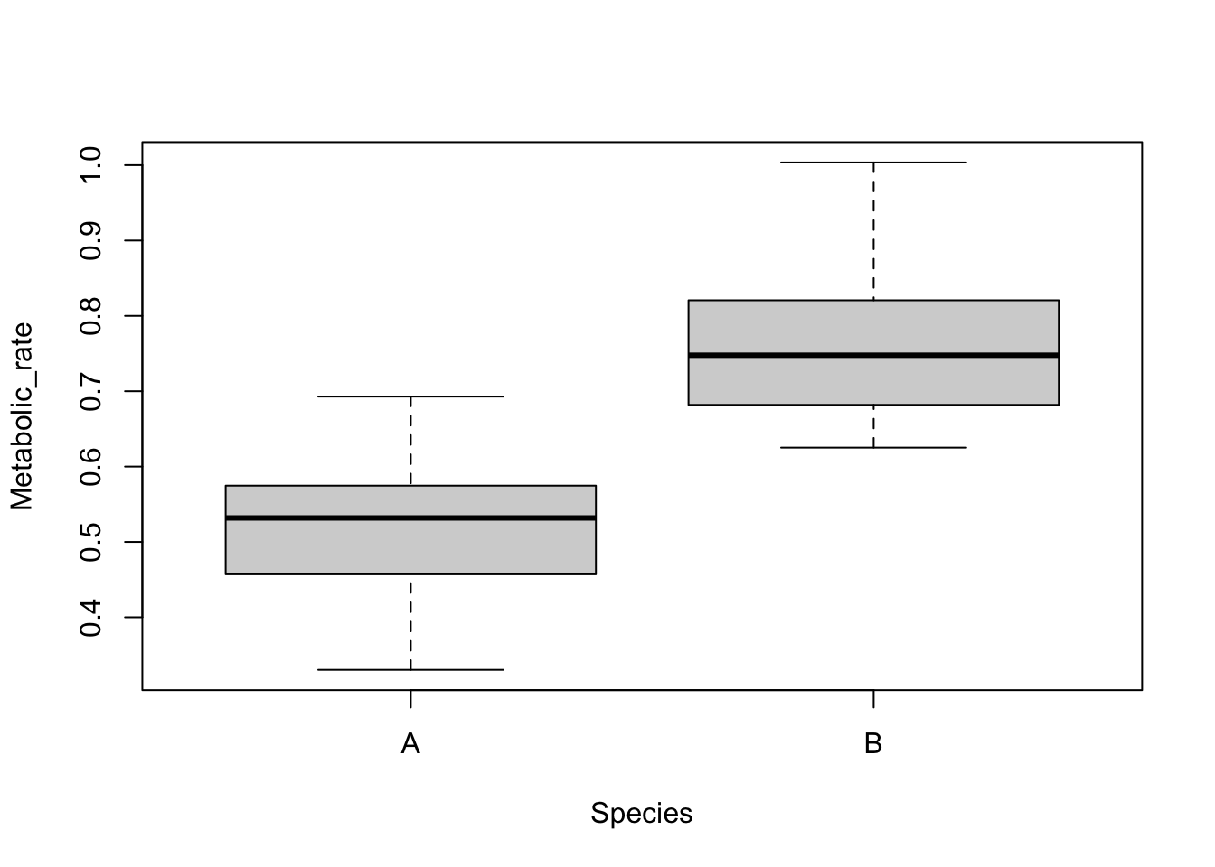
The continuous variable is on the left of the tilde (~) and the categorical variable is on the right. Straight away you can see that species B has a higher metabolic rate than species A.
Bar plots
These sorts of data are also commonly visualised with a bar plot that displays the means of the continuous variable for each level of the categorical variable, with error bars displaying some measures of variation within each category. The error bars could be the standard deviation, standard error or 95% confidence intervals.
While commonly used, they are not so easy to create in the base functions in R. There are various ways to do this, but one is to use the summarise and group_by functions from the package dplyr to calculate the means and measures of variation for each level of your categorical variable (see Summarising data).
Here is some sample code to plot means +/- standard deviations. For more control over error bars, we recommend using the more advanced plotting options in the package ggplot2 (see bar plots with error bars).
library(dplyr)

Species.summary <- Prawns %>% # the names of the new data frame and the data frame to be summarised
  group_by(Species) %>% # the grouping variable
  summarise(
    mean = mean(Metabolic_rate), # calculates the mean
    sd = sd(Metabolic_rate), # calculates the standard deviation
    lower = mean(Metabolic_rate) - sd(Metabolic_rate),
    upper = mean(Metabolic_rate) + sd(Metabolic_rate)
  )
In a new data frame called Species.summary, we now have the means, standard deviations and the lower and upper values that set the size of the error bars for each level of the grouping variable. The limits for the error bars were calculated by adding (upper) or subtracting (lower) the standard deviation from the mean.
We can now use the barplot and arrows functions to make a plot with error bars.
Prawn.plot <- barplot(Species.summary$mean,
  names.arg = Species.summary$Species,
  ylab = "Metabolic rate", xlab = "Species", ylim = c(0, 1)
)

arrows(Prawn.plot, Species.summary$lower, Prawn.plot, Species.summary$upper, angle = 90, code = 3)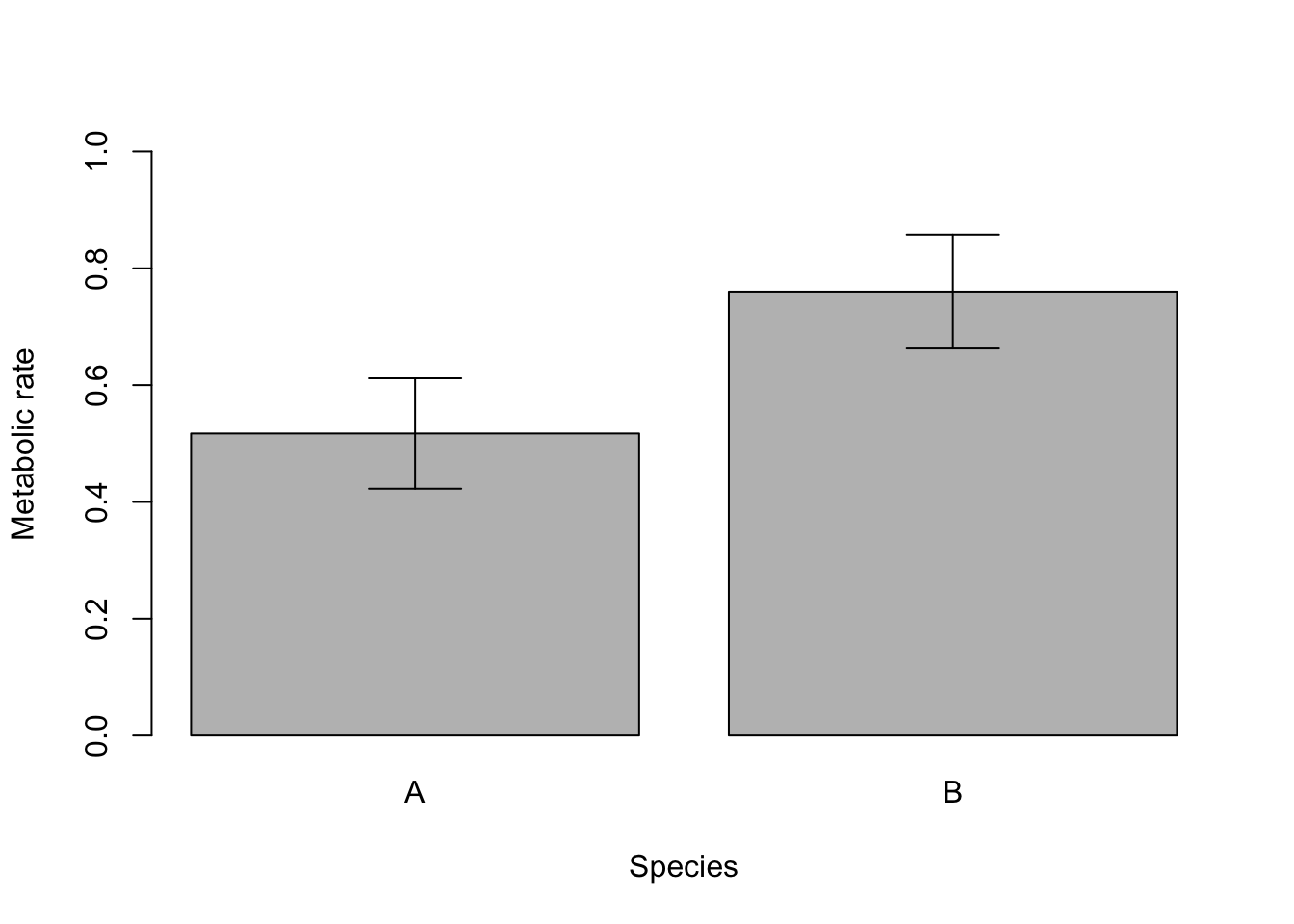
Note that plots of means and error bars can be misleading as they hide the true distributions of the data. Means can also be misleading when data are very skewed, and calculations for error bars using t statistics (e.g., 95% confidence intervals) assume the data are normally distributed.
Formatting plots
Box plots and bar plots can be formatted using the basic R formatting in the base graphics package. The code below details some of the more commonly used formatting commands for these plots. These commands can be used for any plotting function in the graphics package.
Add axis labels or titles
Axis labels are produced with the xlab and ylab arguments. Titles are provided with the main argument. Note that figures in scientific publications rarely have a title, but include information about the plot in a figure legend presented below the plot.
boxplot(Metabolic_rate ~ Species, data = Prawns, xlab = "Species", ylab = "Metabolic rate")Edit axis limits
Axis limits are set by the xlim and ylim arguments, where a vector of the minimum and maximum limits is required. For example to set the Y axis to have a minimum of zero and a maximum of 1, use:
boxplot(Metabolic_rate ~ Species,
  data = Prawns, xlab = "Species", ylab = "Metabolic rate",
  ylim = c(0, 1)
)
Renaming levels of the categorical factor
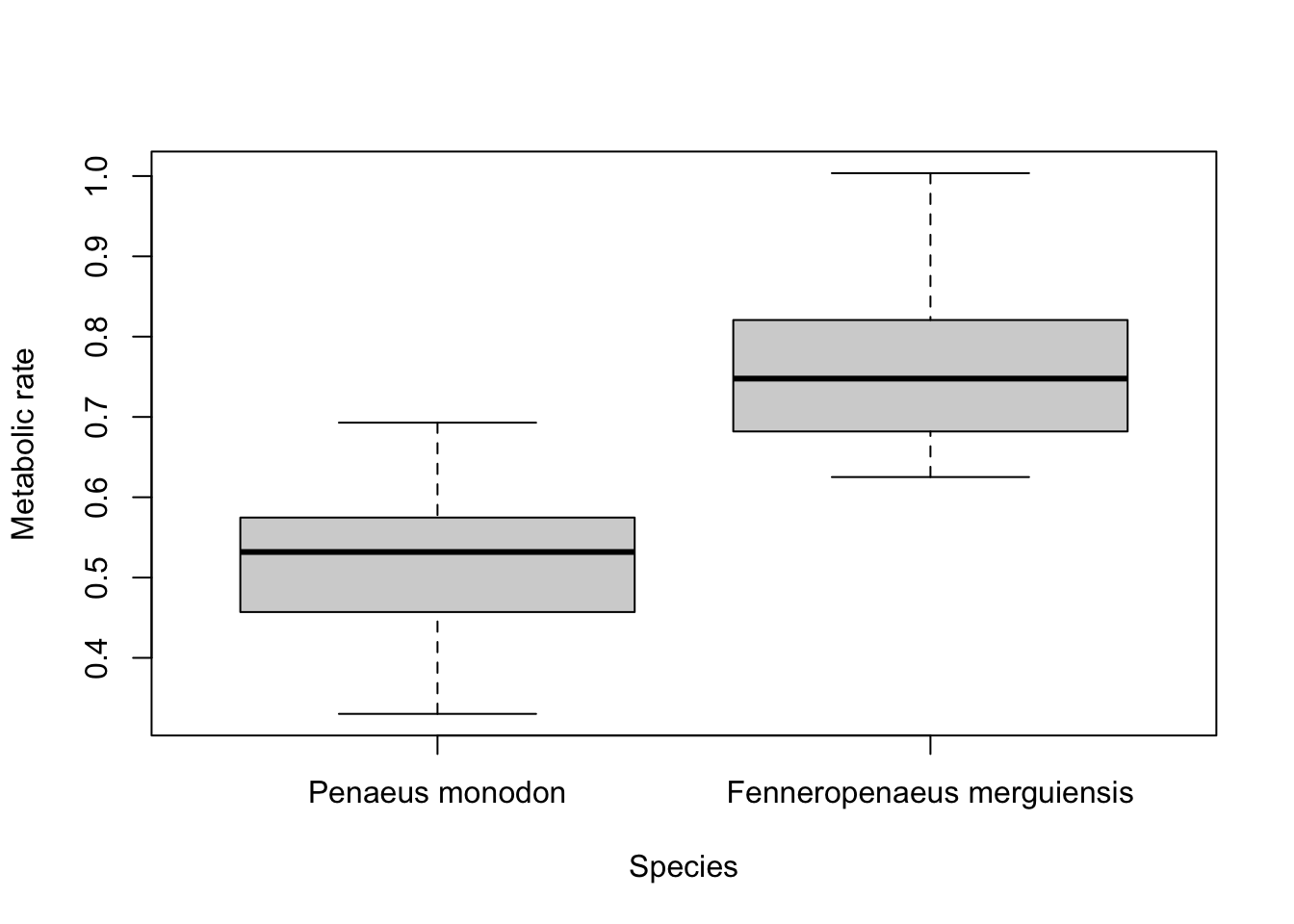
If the levels of your categorical factor are not ideal for the plot, you can rename those with the
names argument. For example, to put the actual species names on:
boxplot(Metabolic_rate ~ Species,
  data = Prawns, xlab = "Species", ylab = "Metabolic rate",
  names = c("Penaeus monodon", "Fenneropenaeus merguiensis")
)
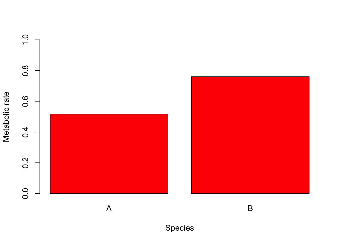
Adding colour
Colour can be added to any part of the plots (axis, fonts etc.) using col argument. There are over 600 colours that can be plotted, type colours() for the whole range.
Here we will simply change the colour of the bars in the bar plot to red.
barplot(Species.summary$mean,
  names.arg = Species.summary$Species,
  ylab = "Metabolic rate", xlab = "Species", ylim = c(0, 1), col = "red"
)
Further help
Type ?boxplot and ?barplot to get the R help for these functions.
Authors: Stephanie Brodie & Alistair Poore
Year: 2016
Last updated: Feb 2022