Multidimensional Scaling
Multidimensional scaling (MDS) is a popular approach for graphically representing relationships between objects (e.g. plots or samples) in multidimensional space. Dimension reduction via MDS is achieved by taking the original set of samples and calculating a dissimilarity (distance) measure for each pairwise comparison of samples. The samples are then usually represented graphically in two dimensions such that the distance between points on the plot approximates their multivariate dissimilarity as closely as possible.
One of the most common applications of MDS in the environmental sciences is to examine the similarity of different ecological communities based on their species composition. In those analyses, the abundance of all species within replicated samples (plots or quadrats in the field, different sites etc.) is recorded and the raw data takes the form of a matrix of species (the variables) by samples.
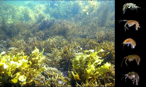
Consider an example where researchers wanted to contrast the feeding specificity of marine herbivores on five species of macroalgae. Twenty replicate individuals of each of seven species of macroalgae were collected from Sydney Harbour, and the abundance of seven species of herbivorous crustacean recorded from each replicate (a raw data matrix of 100 samples x 7 variables, data from Poore et al. 2000).
Multidimensional scaling can create an ordination plot from any measure of similarity or dissimilarity among samples and there are many different measures for calculating the dissimilarity among samples. The most basic of these is the Euclidean distance (i.e., simply the straight-line distance between two points in multivariate space). For contrasts of species composition, however, the most commonly used distance measure is the Bray-Curtis dissimilarity metric. The reason for its popularity is that, compared to other measures, Bray-Curtis is better at handling the large proportion of zeroes (e.g., species absences) commonly found in ecological data sets. This measure won’t consider shared absences as being similar, which makes sense biologically.
In addition to the choice of distance measure there are a number of different classes of MDS. Here we focus on what is referred to as non-metric MDS (nMDS), a non-parametric rank-based method that is comparatively robust to non-linear relationships between the calculated dissimilarity measure and the projected distance between objects.
Running the analysis
Your data should be formatted so that each sample is a row and each variable is a column. Download the herbivore specialisation data set, and import into R to see the desired format.
Herbivores <- read.csv(file = "Herbivore_specialisation.csv", header = TRUE)The first two columns are categorical variables that label the samples as coming from each of the five habitats or as being collected during the day or the night. The third column is the replicate number per combination of habitat and day/night. The fourth column is the biomass of the habitat sampled and the rest of the columns are the counts of each herbivore species in each sample.
To contrast the species composition across habitats or time of sampling, we first need to make a dataframe with only the abundance values for each sample (columns 5 to 11).
Herb_community <- Herbivores[5:11]Creating a MDS plot involves two steps:
* creating a dissimilarity matrix with your chosen metric that measures the similarity between every pair of samples
* creating an ordination plot from that dissimilarity matrix
These can be done in the package vegan. First, install and load the package.
library(vegan)The function metaMDS combines these two steps in a single function.
Herb_community.mds <- metaMDS(comm = Herb_community, distance = "bray", trace = FALSE, autotransform = FALSE)where comm = Herb_community specifies the data frame holding the community data, distance = "bray" indicates you want to use a Bray-Curtis distance measure and trace = FALSE indicates you wish to ignore in progress output of results. autotransform = FALSE stops vegan from automatically transforming the data (see below for advice on transformation).
Calling the plot function on the x-y coordinates of the metaMDS output creates an MDS ordination plot.
plot(Herb_community.mds$points)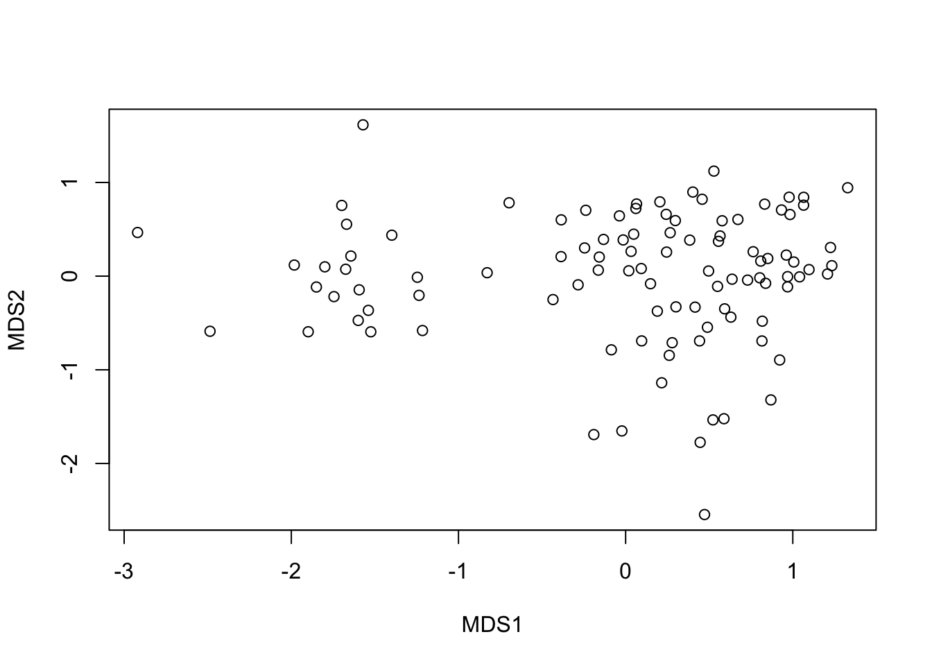
This is not informative until we plot samples from each habitat type (macroalgal species) as a different colour.
To do this we can extract the x and y coordinates from the MDS plot into a new data frame.
MDS_xy <- data.frame(Herb_community.mds$points)Then, we can add our habitat and day vs night factors to those coordinates (i.e. the first two columns of the original data set.
MDS_xy$Habitat <- Herbivores$Habitat
MDS_xy$DayNight <- Herbivores$DayNight
To plot those points, color coded by Habitat, we can use:
library(ggplot2)
ggplot(MDS_xy, aes(MDS1, MDS2, color = Habitat)) +
  geom_point() +
  theme_bw()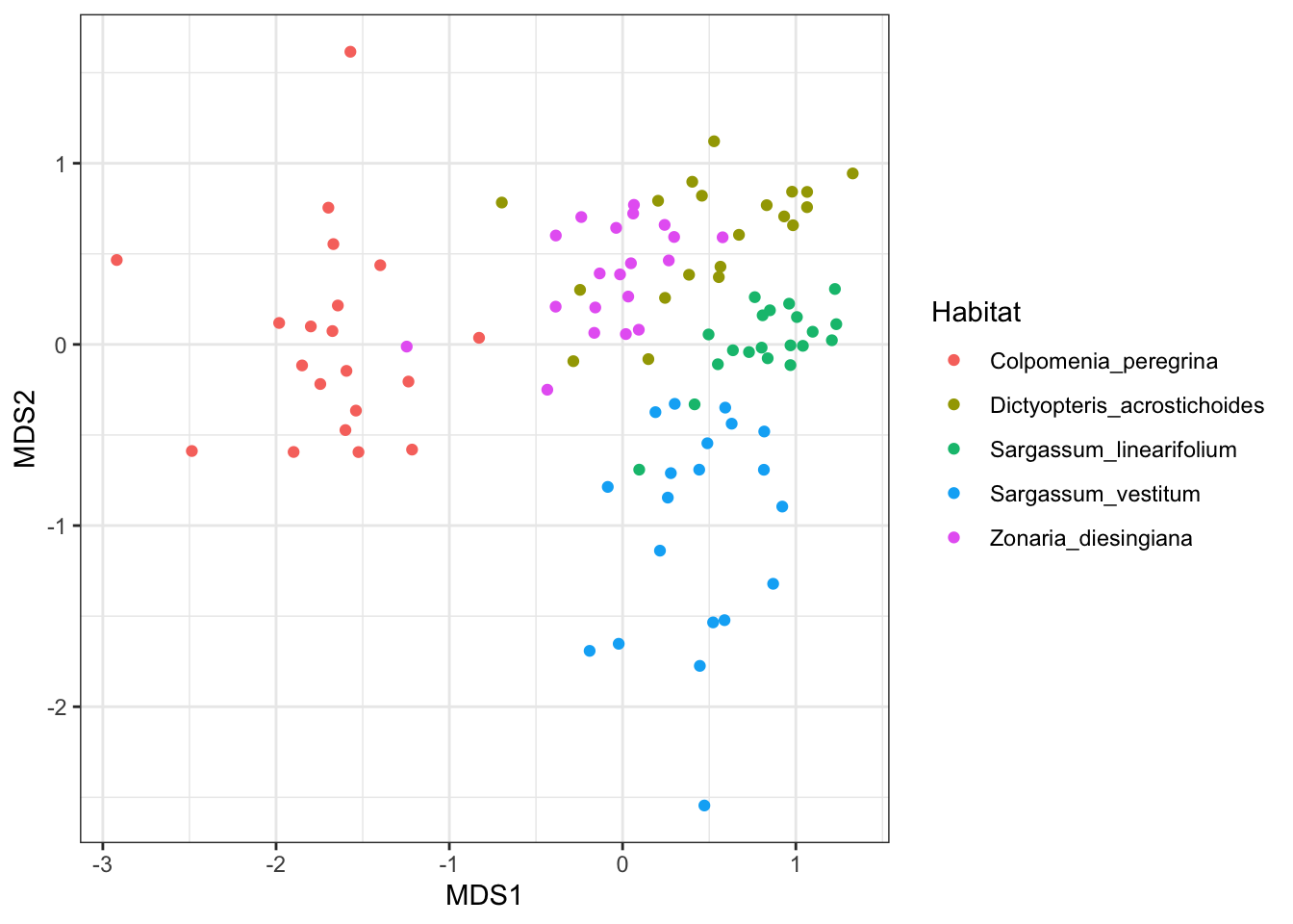
Interpreting the results
Interpreting an MDS plot is reasonably straightforward and the same as for any other ordination plot; objects that are closer together on the plot are more alike than those further apart. MDS arranges the points on the plot so that the distances among each pair of points correlates as best as possible to the dissimilarity between those two samples. The values on the two axes tell you nothing about the variables for a given sample - the plot is just a two dimensional space to arrange the points.
If there is any grouping of samples according to categories of samples, then you have interesting patterns in your multivariate data set. In the plot above, samples from each habitat are more likely to be similar to samples from the same habitat, than samples from ther other habitats (visualised as clusters of different colours). This means that the species composition of herbivores differs across their food plants. Remember, that this is not a statistical test, just a visualisation that helps you seek patterns.
In contrast, if we colour our samples by time of day, you will see that these two groups of samples are mixed on the plot. This suggests no difference in species composition between the two sampling times.
ggplot(MDS_xy, aes(MDS1, MDS2, color = DayNight)) +
  geom_point() +
  theme_bw()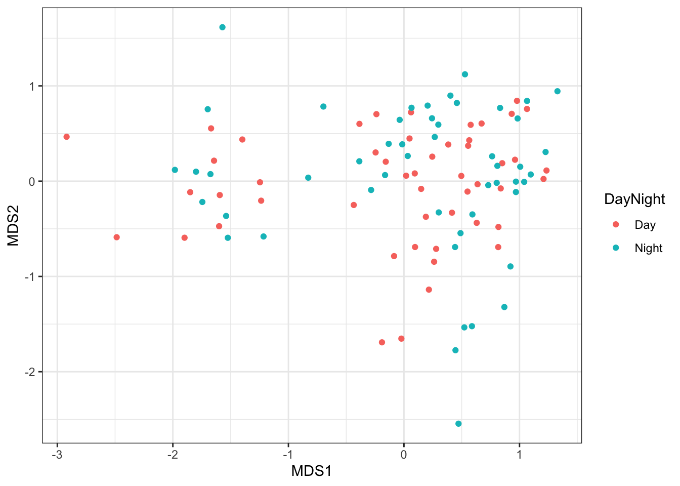
Assumptions to check
As a rank-based approach NMDS, is comparatively robust to non-linearity between inter-object distance in space and their multivariate dissimilarity.
Stress. Not an assumption of the process, but the most important factor to consider after generating an MDS plot is the ‘stress’. The stress provides a measure of the degree to which the distance between samples in reduced dimensional space (usually 2-dimensions) corresponds with the actual multivariate distance between the samples. Lower stress values indicate greater conformity and therefore are desirable. High stress values indicate that there was no 2-dimensional arrangement of your points that reflect their similarities. A rule of thumb is that stress values should ideally be less than 0.2 or even 0.1.
You can obtain the stress value from your plot with:
Herb_community.mds$stress## [1] 0.1485343If the stress value is greater than 0.2, it is advisable to include an additional dimension, but remember that human brains are not very well equipped to visualise objects in more than 2-dimensions.
Transformation and standardisation. Transforming data sets prior to creating a MDS plot is often desirable, not to meet assumptions of normality, but to reduce the influence of extreme values. For example,
Herb_community.sq <- sqrt(Herb_community)
Herb_community.sq.mds <- metaMDS(comm = Herb_community.sq, distance = "bray", trace = FALSE)
Standardising samples or variables (by their mean or totals) may also be done, to create plots where all variables have equal influence, or plots where the differences among samples is purely based on relative values not their magnitude. Several common methods of standardisation used for community data sets are provided in the vegan function decostand.
Remember that any of these modifications do actually change your question. If the example above was done with samples standardised by total abundance, then the plot would represent a contrast of species composition with no influence of the different abundances found on the different habitats.
Please also note that ordination based on distances has been criticised for failing to account for the mean-variance relationships that are commonplace in abundance data sets like the one used here, and for lacking an underlying statistical model - see Hui et al. (2014) Model-based approaches to unconstrained ordination. Methods in Ecology and Evolution 6:399-411. link.
Communicating the results
Visual. The results from a MDS are best presented visually as a 2-dimensional ordination plot (as above). Rarely, a 3-dimensional plot may be used.
Written. The written description of the MDS analyses (often in the figure legend) should mention what dissimilarity metric was used, whether data were transformed or standardised, and present the stress value. In a formal analysis, MDS plots are usually accompanied by some multivariate statistical test of dissimilarity between treatment/observational groups, e.g., via the adonis function in vegan.
Further help
Type ?metaMDS for the R help for this function.
Quinn, GP and MJ Keough (2002) Experimental design and data analysis for biologists. Cambridge University Press. Ch. 18. Multidimensional scaling and cluster analysis.
McKillup, S (2012) Statistics explained. An introductory guide for life scientists. Cambridge University Press. Ch. 22. Introductory concepts of multivariate analysis.
Author: Andrew Letten
Year: 2016
Last updated: Feb 2022