The Basics of ggplot2
Creating a ggplot
First, you will need to install the package ggplot2 on your machine, then load the package with the usual library function.
library(ggplot2)The starting point for creating a plot is to use the ggplot function with the following basic structure:
plot1 <- ggplot(data, aes(x_variable, y_variable)) +
  geom_graph.type()

print(plot1)
data is a data frame that holds the variables that you would like to plot.
aes specifies which variables to plot. This code commonly causes confusion when creating ggplots. While aes stands for aesthetics, in ggplot it does not relate to the visual look of the graph but rather what data you want to see in the graph. It specifies what the graph presents rather than how it is presented.
+ geom_graph.type specifies what sort of plot you want to make. ggplot will not work unless you have this added on. You don’t actually type ‘graph.type()’, but choose one of the types of graph.
Commonly used examples include:
* scatterplot - + geom_point()
* boxplot - + geom_boxplot()
* histogram - + geom_histogram()
* bar plot - + geom_bar()
Ensure there is a open and closed bracket after the geom code. This tells R to make the graph with the basic standard formatting for this graph type.
The type of graph you want to make has to match the classes of the inputs. For example, a scatterplot would require both variables to be numeric. Or a boxplot would require the x variable to be a factor and the y variable to be numeric. You can check the class of any variable with the class function, or all variables in a data frame with the str function.
A helpful practise when making ggplots is to assign the plot you’ve made to an object (e.g., plot1 in the code above) and then ‘print’ it separately. As your ggplot becomes more complicated this will make it much easier.
Example plots
In these examples, let’s use a data set that is already in R with the length and width of floral parts for three species of iris. First, load the data set:
data(iris)To contrast petal length across the three species of iris with a box plot, we would use:
plot1 <- ggplot(iris, aes(Species, Petal.Length)) +
  geom_boxplot()
print(plot1)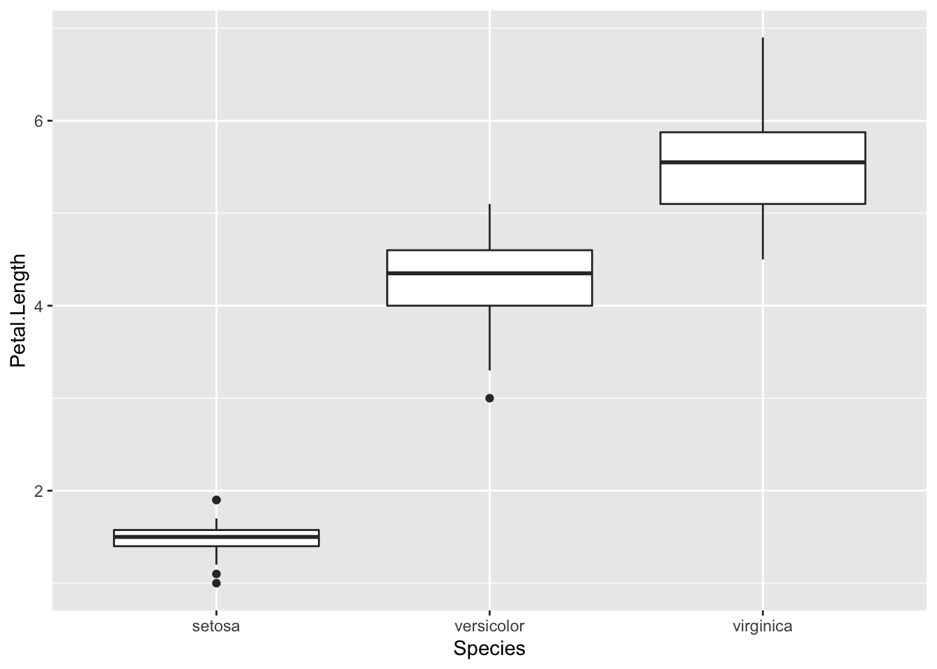
Note how aes included the x then the y variables which you wanted to plot, and that + geom_boxplot() specified a boxplot.
To plot a frequency histogram of petal length, we would use:
plot2 <- ggplot(iris, aes(Petal.Length)) +
  geom_histogram()
print(plot2)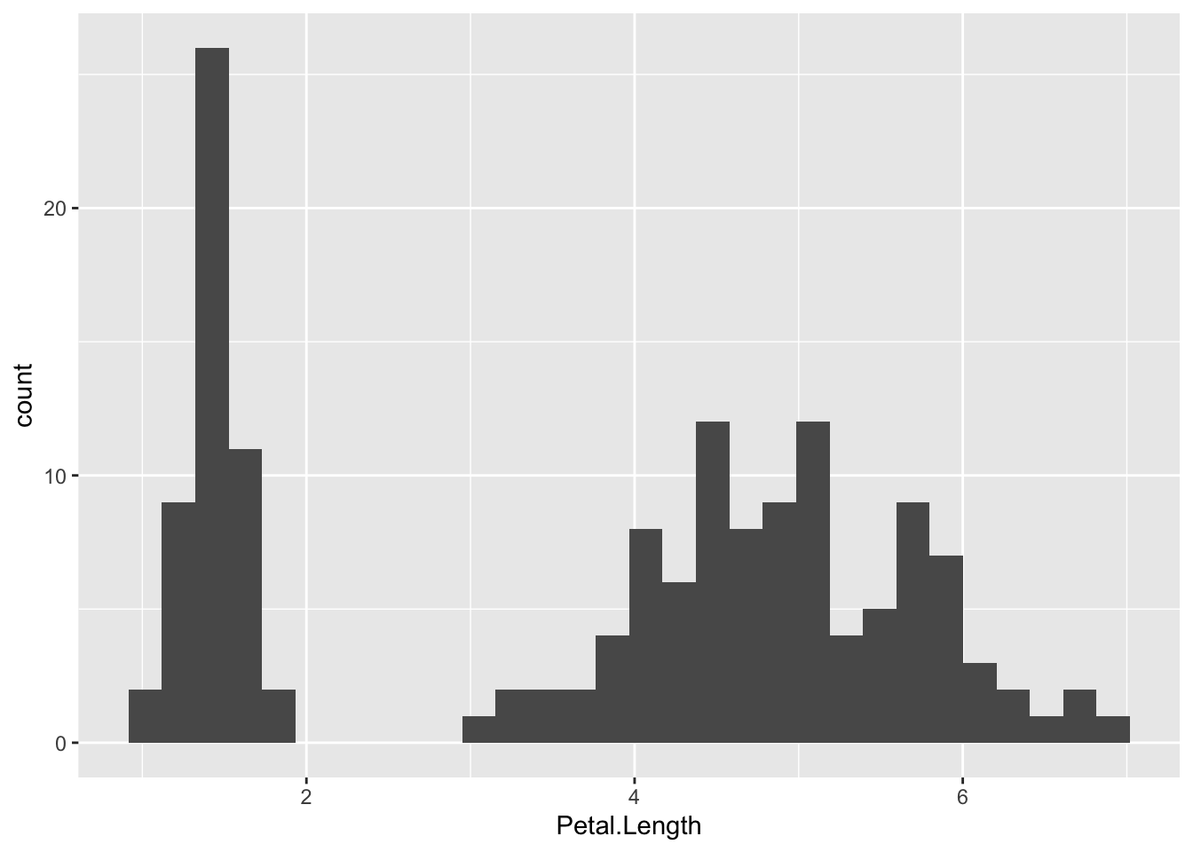
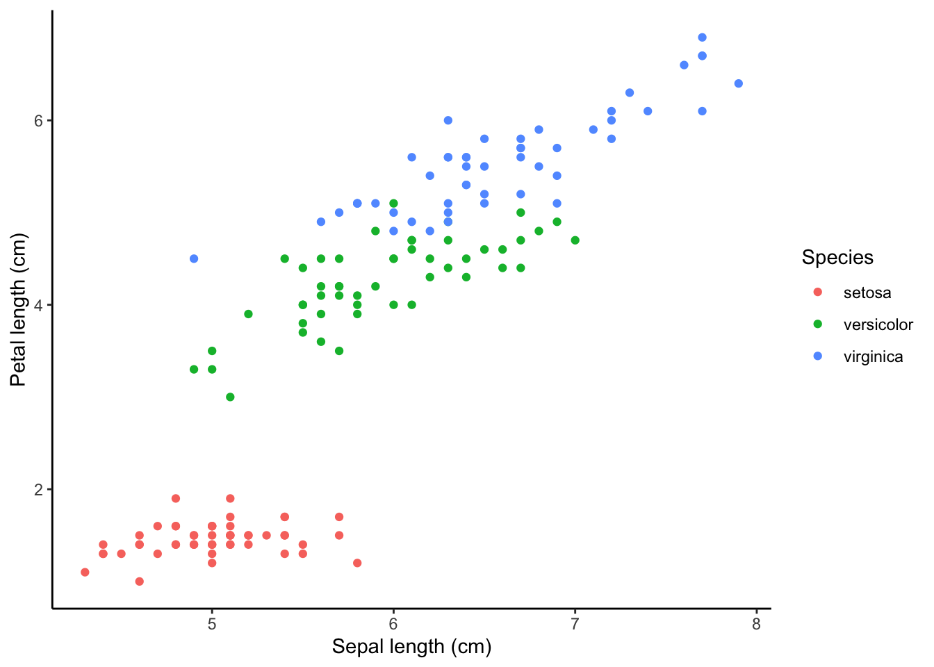
To use a scatter plot the visualise the relationship between petal length and sepal length, we would use:
plot3 <- ggplot(iris, aes(Sepal.Length, Petal.Length)) +
  geom_point()
print(plot3)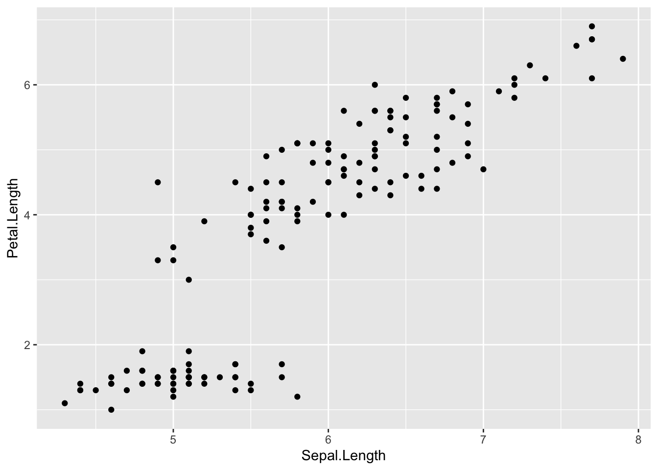
These points could then be coloured according to the levels of a categorical variable. To do this, add colour="categorical.variable" in the aes brackets. To colour by species, we would use:
plot4 <- ggplot(iris, aes(Sepal.Length, Petal.Length, colour = Species)) +
  geom_point()
print(plot4)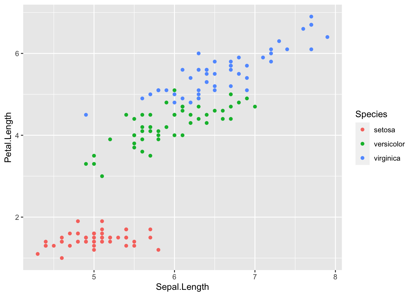
Adding a basic theme
The overall look of the ggplot can be altered with different set themes. This can be done by adding + theme_bw() or + theme_classic() to the end of your line of code. Like geom(), ensure there is open and closed brackets after the theme name.
plot5 <- ggplot(iris, aes(Sepal.Length, Petal.Length, colour = Species)) +
  geom_point() +
  theme_bw()
print(plot5)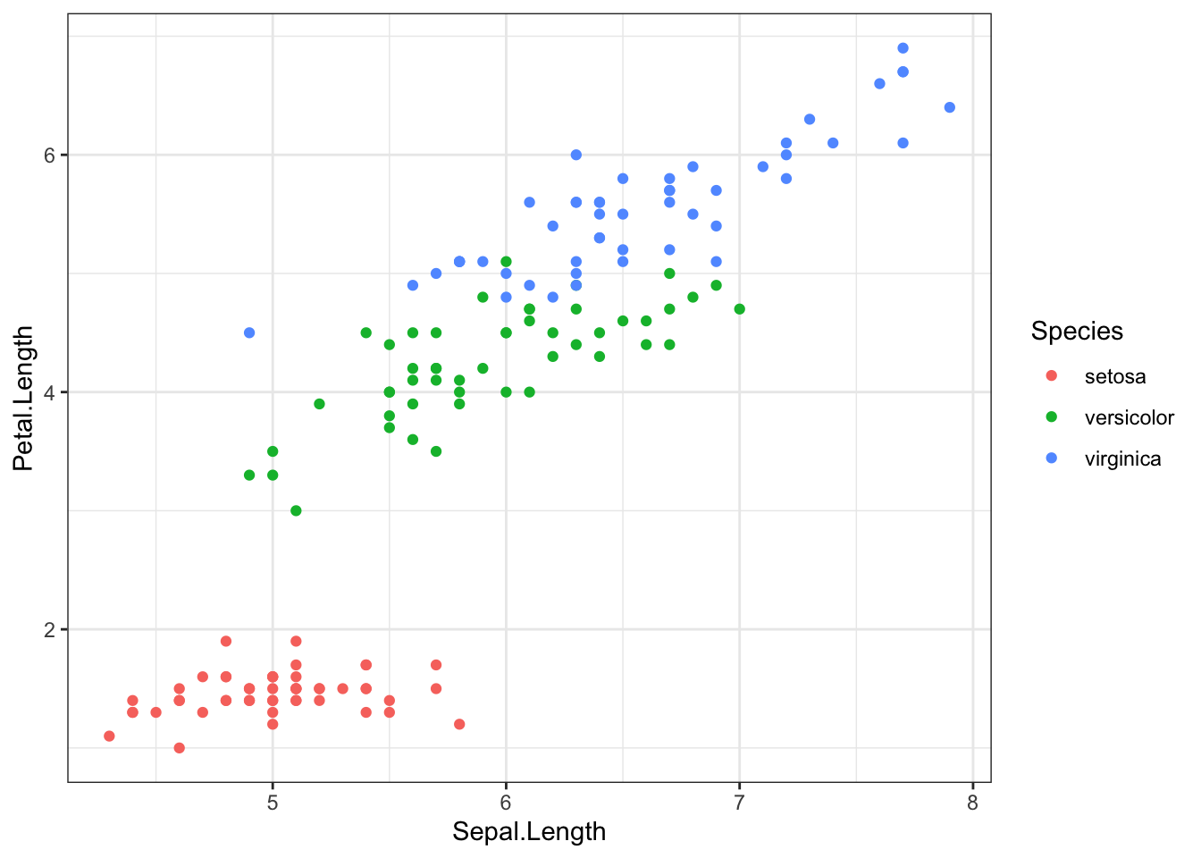
plot6 <- ggplot(iris, aes(Sepal.Length, Petal.Length, colour = Species)) +
  geom_point() +
  theme_classic()
print(plot6)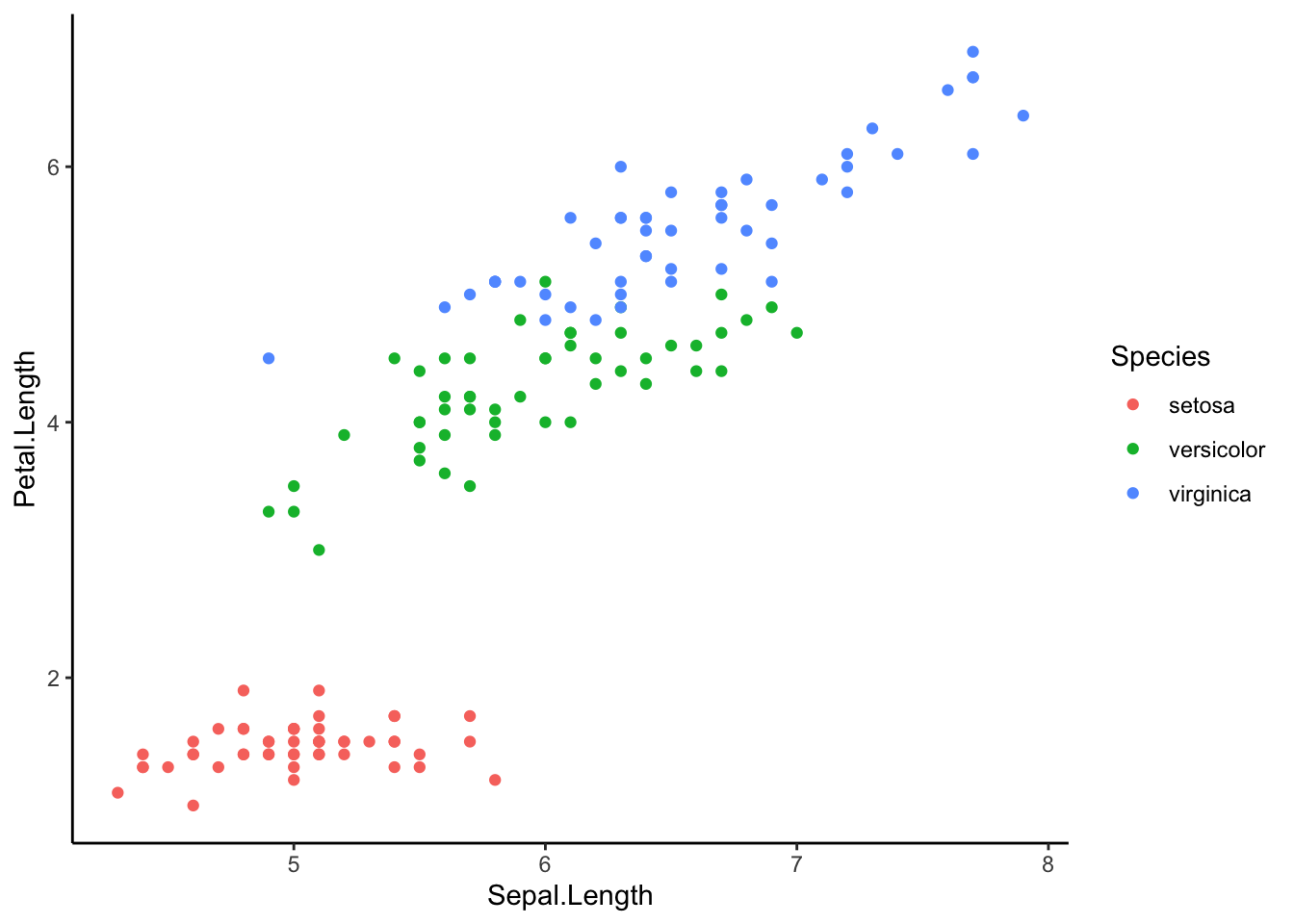
###Further help
To further customise the aesthetics of the graph, including colour and formatting, see our other ggplot help pages:
* altering the overall appearance
* adding titles and axis names
* colours and symbols.
Help on all the ggplot functions can be found at the The master ggplot help site.
A useful cheat sheet on commonly used functions can be downloaded here.
Chang, W (2012) R Graphics cookbook. O’Reilly Media. - a guide to ggplot with quite a bit of help online here
Author: Fiona Robinson
Year: 2016
Last updated: Feb 2022