Linear Regression
Linear regression is the one of the most widely used statistical techniques in the life and earth sciences. It is used to model the relationship between a response (also called dependent) variable \(y\) and one or more explanatory (also called independent or predictor) variables \(x_{1}\),\(x_{2}\)…\(x_{n}\). For example, we could use linear regression to test whether temperature (the explanatory variable) is a good predictor of plant height (the response variable).

In simple linear regression, with a single explanatory variable, the model takes the form:
\[y = \alpha + \beta x + \varepsilon \]
where \(\alpha\) is the intercept (value of \(y\) when \(x\) = 0), \(\beta\) is the slope (amount of change in \(y\) for each unit of \(x\)), and \(\varepsilon\) is the error term. It is inclusion of the error term, also called the stochastic part of the model, that makes the model statistical rather than mathematical. The error term is drawn from a statistical distribution that captures the random variability in the response. In standard linear regression this is assumed to be a normal (Gaussian) distribution.
Note that the linear in linear model does not imply a straight-line relationship but rather that the response is a linear (additive) combination of the effects of the explanatory variables. However, because we tend to start by fitting the simplest relationship, many linear models are represented by straight lines.
Note that a linear regression is just a special case of a linear model, where both the response and predictor variables are continuous.
Running the analysis
The goal in linear regression is obtain the best estimates for the model coefficients (\(\alpha\) and \(\beta\)). In R you can fit linear models using the function lm.
For this worked example, download a data set on plant heights around the world, Plant_height.csv, and import into R.
Plant_height <- read.csv(file = "Plant_height.csv", header = TRUE)The main argument to lm is the model formula y ~ x, where the response variable is on the left of the tilde (~) and the explanatory variable is on the right. lm also has an optional data argument that lets you specify a data frame from which the variables will be taken.
To test whether plant height is associated with temperature, we would model height as the dependent variable (in this case we are using the log of plant height) and temperature as the predictor variable.
lm(loght ~ temp, data = Plant_height)Interpreting the results
To obtain detailed output (e.g., coefficient values, R2, test statistics, p-values, confidence intervals etc.), assign the output of the lm function to a new object in R and use the summary function to extract information from that model object.
model <- lm(loght ~ temp, data = Plant_height)
summary(model)
##
## Call:
## lm(formula = loght ~ temp, data = Plant_height)
##
## Residuals:
## Min 1Q Median 3Q Max
## -1.97903 -0.42804 -0.00918 0.43200 1.79893
##
## Coefficients:
## Estimate Std. Error t value Pr(>|t|)
## (Intercept) -0.225665 0.103776 -2.175 0.031 *
## temp 0.042414 0.005593 7.583 1.87e-12 ***
## ---
## Signif. codes: 0 '***' 0.001 '**' 0.01 '*' 0.05 '.' 0.1 ' ' 1
##
## Residual standard error: 0.6848 on 176 degrees of freedom
## Multiple R-squared: 0.2463, Adjusted R-squared: 0.242
## F-statistic: 57.5 on 1 and 176 DF, p-value: 1.868e-12The estimates for the coefficients give you the slope and intercept. In this example, the regression equation for (log) plant height as a function of temperature is:
\[log(plant height) = -0.22566 +0.0421.temperature + \varepsilon \]
Calling summary on a model object produces a lot of useful information but one of the main things to look out for are the t-statistics and p-values for each coefficient. These test the null hypothesis that the true value for the coefficient is 0.
For the intercept we usually don’t care if it is zero or not, but for the other coefficient (the slope), a value significantly differing from zero indicates that there is an association between that explanatory variable and the response. In this example, an increase in temperature is associated with an increase in plant height.
Whilst the t-statistics and p-values indicate a significant association, the strength of the association is captured by the R2 value, the proportion of variance in the response that is explained by the explanatory variable(s).
The F-statistic and associated p-value indicates whether the model as a whole is significant. The model will always be significant if any of the coefficients are significant. With only one predictor variable, the probability associated with the t test, that tests whether the slope differs from zero, is identical to the probability associated with the F statistic.
We can also obtain 95% confidence intervals for the two parameters. Showing that the intervals for the slope do not include zero is another way of showing that there is an association between the dependent and predictor variable.
confint(model)## 2.5 % 97.5 %
## (Intercept) -0.43047074 -0.02085828
## temp 0.03137508 0.05345215Assumptions to check
Linearity. There is no point trying to fit a staight line to data that are curved! Curvilinear relationships produce U-shaped patterns in plots of the residuals vs the fitted values. Using the plot function on a model object provides a series of four graphical model diagnostics, the first of which is a plot of residuals versus fitted values.
plot(model, which = 1)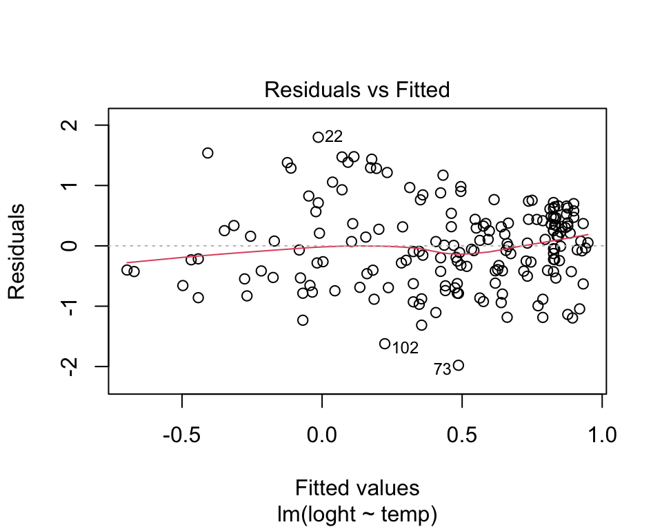
The absence of strong patterning in the above plot indicates the assumption of linearity is valid. If there is strong patterning, one potential solution is to log-transform the response. Note in the above example plant height had already been log-transformed. An alternative solution is to fit a linear model of the response as a polynomial function (e.g. quadratic) of the response. The simplest way to do this in R is to use the poly function.
Click here to see a nice interactive app that shows you what patterns of residuals you would expect with curved relationships
Constant variance. An even spread of data around the regression line is desirable. If the plot of residuals versus fitted values is fan-shaped the assumption of constant variance (aka homogeneity of variance) is violated. A log-transformation of the response variable may fix this problem, but if it doesn’t the best solution is to use a different error distribution in a generalised linear model framework (GLM). See the Generalised linear models 1 for more information.
Normality. Checks of whether the data are normally distributed are usually performed by either plotting a histogram of the residuals or via a quantile plot where the residuals are plotted against the values expected from a normal distribution (the second of the figures obtained by plot(model). If the points in the quantile plot lie mostly on the line, the residuals are normally distributed. Violations of normality can be fixed via transformations or by using a different error-distribution in a GLM. Note, however, that linear regression is reasonably robust against violations of normality.
par(mfrow = c(1, 2)) # This code put two plots in the same window
hist(model$residuals) # Histogram of residuals
plot(model, which = 2) # Quantile plot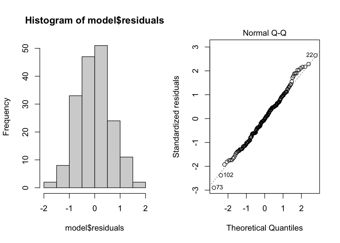
Independence. The observations of the response should be independent of each other. Non-independent observations are those that are in some way associated with each other beyond that which is explained by the predictor variable(s). For instance, samples collected from the same site, or repeatedly from the same object, may be more alike due to some additional factor other than the measured explanatory variable. Ensuring independence is an issue of experimental and sampling design and we usually know if the data are independent or not in advance of our analysis.
There are a variety of measures for dealing with non-independence. These include ensuring all important predictors are in the model; averaging across nested observations; or using a mixed-model (see Mixed models 1).
Communicating the results
Written The results of linear regression may be presented in the text in a number of different ways, but a short sentence is often adequate, e.g., “plant height exhibited a significant (F = 57.5, p < 0.01) negative relationship with temperature”. However, if you have run several analyses (or if there is more than one predictor), it may be useful to present the results as a table with coefficient values, standard errors and p-values for each explanatory variable.
Visual For a linear regression with a single explanatory variable, it is useful to present the results as a scatter plot. The line of best fit derived from the model can be added with the abline function.
plot(loght ~ temp, data = Plant_height, xlab = "Temperature (C)", ylab = "log(Plant height)", pch = 16)
abline(model, col = "red")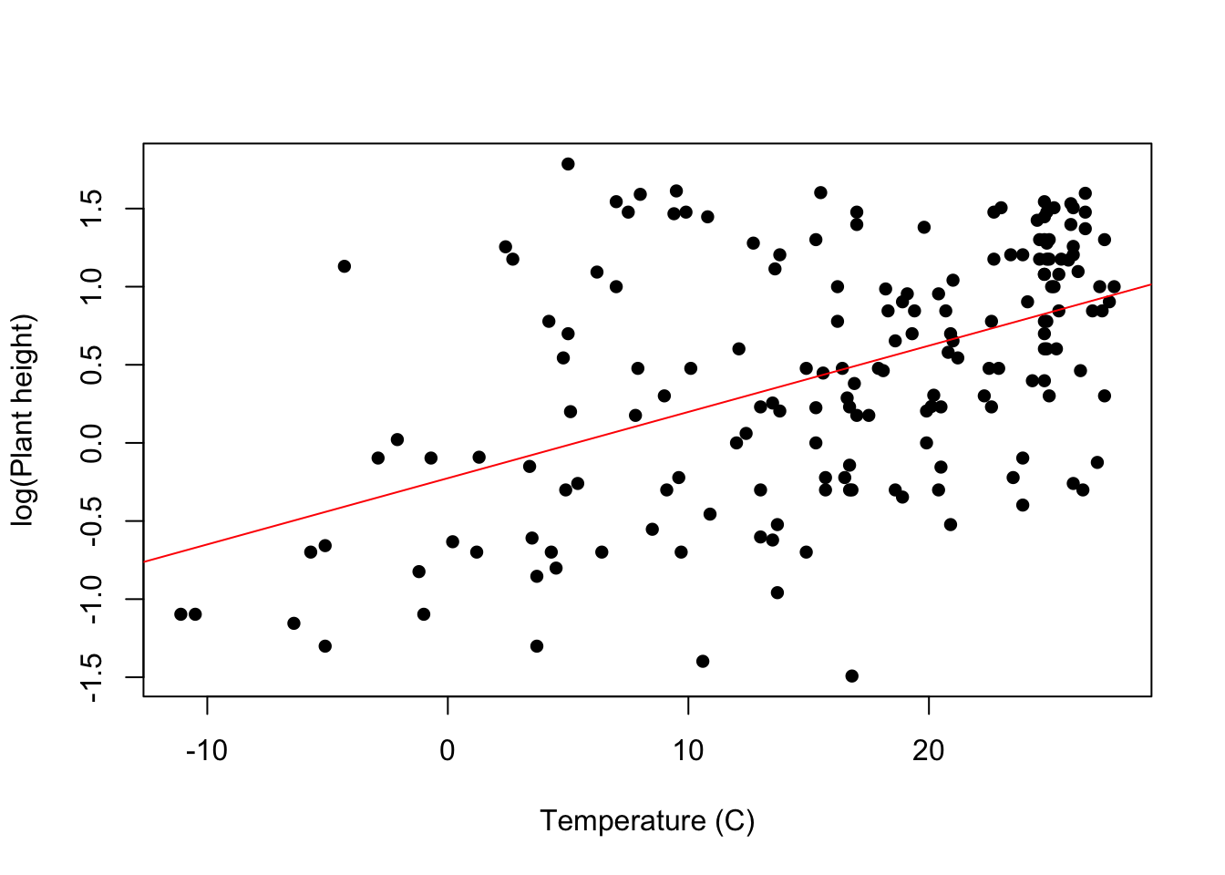
Further help
Type ?lm to get the R help for this function.
Quinn and Keough (2002) Experimental design and data analysis for biologists. Cambridge University Press. Ch. 5 Correlation and regression.
McKillup (2012) Statistics explained. An introductory guide for life scientists. Cambridge University Press. Ch. 17 Regression.
More advice on interpreting coefficients in linear models
Author: Andrew Letten
Year: 2016
Last updated: Feb 2022