Contingency Tables
Contingency tables are used to test for associations between two or more categorical variables. The data take the form of counts of observations that have been classified by these categorical variables.

For example, consider the bill and face colours of the endangered Gouldian Finch (Erythrura gouldiae) living in the savannahs of northern Australia. They are polymorphic, having either red, yellow or black faces. Their bills are also either red, yellow or black, but bill colour is not always the same as face colour. All birds in a sample could be classified into all nine combinations of face and bill colour and the counts of each held in a two-way table:
##             Black face Red face Yellow face
## Black bill          16        5           6
## Red bill            19       20           6
## Yellow bill         18       22          22
To test whether one variable is associated with the other we contrast the observed counts to the expected counts if there was no association (in other words if the two variables were entirely independent of each other). In this example, we would be testing whether bill colour varied independently from face colour.
The counts expected under this null model are calculated from the row and column totals of the table holding the observed data. For each cell in the table, the expected count is:
(row total x column total)/grand total
When we do this for each cell, we obtain a new table with all expected values:
##             Black face  Red face Yellow face
## Black bill    10.67910  9.470149    6.850746
## Red bill      17.79851 15.783582   11.417910
## Yellow bill   24.52239 21.746269   15.731343
These are the expected counts if the null hypothesis is true. In this example, if the numbers of black, red and yellow faced birds are in the same proportions for each of the bill colours.
The observed counts are then contrasted to the expected counts with the \(\chi^2\) test statistic,
\(\chi^{2} = \sum_{i=1}^{k} \frac{(O_{i}-E_{i})^2}{E_{i}}\)
where O and E are the observed and expected numbers in each of the cells of the table.
Running the analysis
With a calculator, you could calculate \(\chi^2\) and then determine the probability of obtaining that \(\chi^2\) value from a table of the known probability distribution of \(\chi^2\). In R, we can obtain that probability by:
pchisq(x, df, lower.tail = FALSE)with x = your value of \(\chi^2\), and degrees of freedom (df) = (number of row-1) x (number of columns-1). The lower.tail = FALSE bit gives you the probability that \(\chi^2\) is greater than your value.
Easier, is to run the whole analysis in R. Firstly, you would need to enter the observed counts as a matrix.
Gfinch <- matrix(c(16, 19, 18, 5, 20, 22, 6, 6, 22), nrow = 3, dimnames = list(c("Black bill", "Red bill", "Yellow bill"), c("Black face", "Red face", "Yellow face")))nrow tells R how many rows you have. dimnames labels the rows and columns.
Check that you have entered the data correctly by simply entering the name of the matrix you just made.
GfinchRun the contingency analysis with the chisq.test function.
chisq.test(x, correct = F)where x is the name of the matrix holding the observed data (for this example use the object Gfinch)
Interpreting the results
The output from a contingency table is very simple: the value of \(\chi^2\), the degrees of freedom and the p-value. The p-value gives the likelihood of your observed counts coming from a population where the null hypothesis was true.
##
##  Pearson's Chi-squared test
##
## data:  Gfinch
## X-squared = 12.881, df = 4, p-value = 0.01187
In this example, the probability that the observed counts are derived from a population where the null hypothesis was true is 0.01187. We would then reject the null hypothesis and conclude that there was an association between bill and face colour.
It is important to remember that this is not testing either of the variables in isolation (e.g., whether black faced birds are more commonly encountered that red or yellow faced birds), but an association between both variables (i.e., whether bill colour is independent of face colour).
To explore which of the cells is the table had more observations than expected, or had fewer observations than expected, look at the standardised residuals. These are the differences between the observed and expected, standardised by the square root of the expected. These are standardised because contrast of the absolute differences (observed - expected) can be misleading when the size of the expected values vary. For example, a difference of 5 from an expectation of 10 is an increase of 50%, but a difference of 5 from an expectation of 100 is only a 5% change).
chisq.test(Gfinch)$residuals## Black face Red face Yellow face
## Black bill 1.628236 -1.45259188 -0.3250357
## Red bill 0.284793 1.06130659 -1.6033875
## Yellow bill -1.317120 0.05441038 1.5804894In this example, you can see that birds with a black face are more likely to have a black bill than expected by chance, and less likely to have a yellow bill.
Assumptions to check
Independence. The \(\chi^2\) test assumes that the observations are classfied into each category independently of each other. This is a sampling design issue and is usually avoided by random sampling. In this example, there would be problems is you deliberately chose birds with a combination of bill and face colour if you were missing that combination in the birds already sampled.
Sample size. The \(\chi^2\) statistic can only be reliably compared to the \(\chi^2\) distribution if sample sizes are sufficiently large. You should check that at least 20% of the expected frequencies are larger than 5. You can see the expected counts for each category by adding $expected to the end of your \(\chi^2\) test. For example,
chisq.test(Gfinch)$expectedIf this assumption has not been met, you could combine categories (if you have more than two and makes sense to do so), run a randomisation test or consider log-linear modelling.
Communicating the results
Written. The results of analysing a contingency table can be easily presented in the text of a results section. For example, “There was a significant association between the bill colour and the face colour of Gouldian finches (\(\chi^2\) = 12.88, df = 2, P = 0.01).”
Visual. Count data are best presented as a bar plot with the counts on the Y axis and the categories on the X axis.
barplot(Gfinch, beside = T, ylab = "Count", xlab = "Face colour", col = c("black", "red", "yellow"))
legend("topright", inset = 0.15, c("Black bill", "Red bill", "Yellow bill"), pch = 15, col = c("black", "red", "yellow"))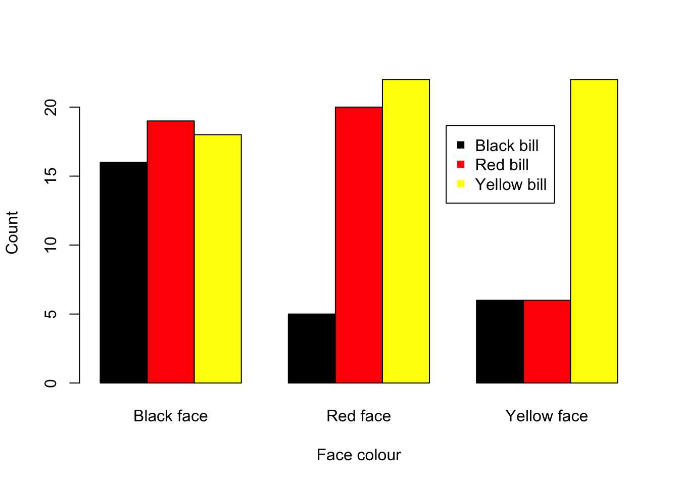
See the graphing modules for making better versions of these figures that are suitable for reports or publications.
Further help
Type chisq.test to get the R help for this function.
Quinn and Keough (2002) Experimental design and data analysis for biologists. Cambridge University Press. Chapter 14. Analyzing frequencies.
McKillup (2012) Statistics explained. An introductory guide for life scientists. Cambridge University Press. Chapter 20.3 Comparing proportions among two or more independent samples.
Author: Alistair Poore
Year: 2016
Last updated: Feb 2022