Titles and Axes Labels
ggplots are almost entirely customisable. This gives you the freedom to create a plot design that perfectly matches your report, essay or paper.
This page provides help for adding titles, legends and axis labels.
Before you get started, read the page on the basics of plotting with ggplot and install the package ggplot2.
library(ggplot2)
In these examples, let’s use a data set that is already in R with the length and width of floral parts for three species of iris. First, load the data set:
data(iris)The following code for a scatter plot of petal length vs sepal length with the three species colour-coded is the base that we will use throughout this tutorial:
IrisPlot <- ggplot(iris, aes(Sepal.Length, Petal.Length, colour = Species)) +
  geom_point()
Adding a title
To add a title to your plot, add the code +ggtitle("Your Title Here") to your line of basic ggplot code. Ensure you have quotation marks at the start and end of your title.
print(IrisPlot + ggtitle("Petal and sepal length of iris"))
If you have a particulary long title that would work better on two lines, use \n for a new line. Make sure to use the correct slash.
print(IrisPlot + ggtitle("Petal and sepal length \nof three species of iris"))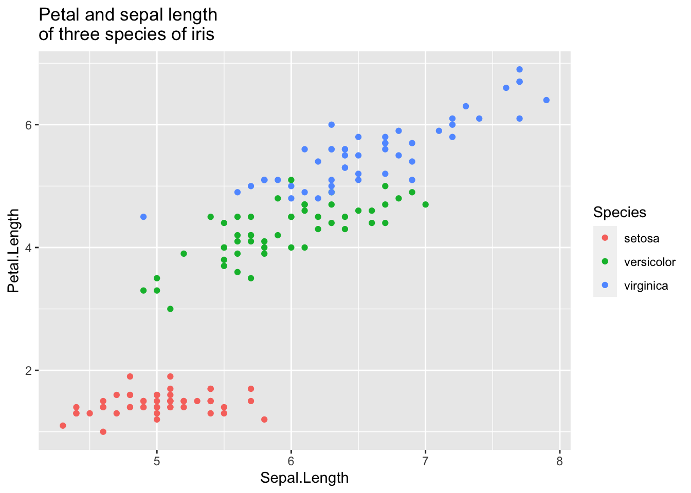
Changing axis labels
To alter the labels on the axis, add the code +labs(y= "y axis name", x = "x axis name") to your line of basic ggplot code.
print(IrisPlot + labs(y = "Petal length (cm)", x = "Sepal length (cm)"))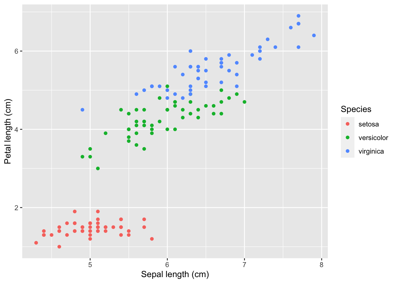
Note: You can also use +labs(title = "Title") which is equivalent to ggtitle.
For example:
print(IrisPlot + labs(
  title = "Petal and Sepal Length \nof Iris",
  y = "Petal Length (cm)", x = "Sepal Length (cm)"
))
Changing the legend title
In the same way you edited the title and axis names, you can alter the legend title by adding +labs(colour = "Legend Title") to the end of your basic plot code. Note: This will only work if you have actually added an extra variable to your basic aes code (in this case, using colour=Species to group the points by Species).
IrisPlot <- ggplot(iris, aes(Sepal.Length, Petal.Length, colour = Species)) +
  geom_point()

print(IrisPlot + labs(colour = "Iris species"))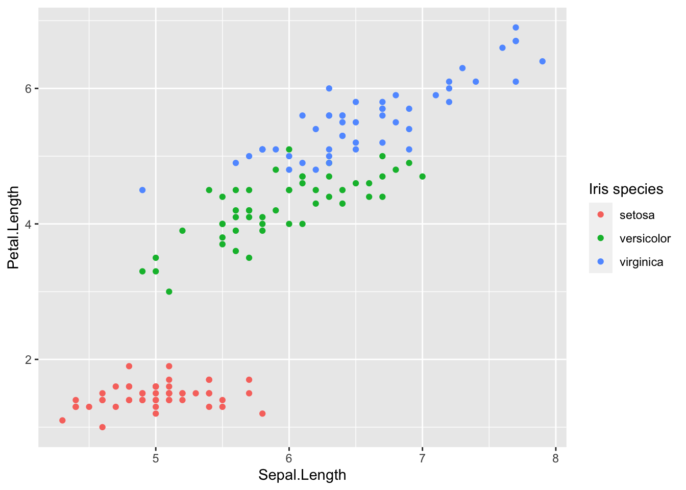
Note: If you are using a histogram, boxplot or bar graph then it is slightly different. You must use fill instead of colour.
IrisBox <- ggplot(iris, aes(Species, Sepal.Length, fill = Species)) +
  geom_boxplot()
print(IrisBox + labs(fill = "Iris species"))
Altering the text style of your legend, axis or title
The font, colour, size and emphasis of your labels and text can all be altered. To do this, use the code theme() and customise with element_text() to alter these properties.
The basic format is: mytheme <- theme(title type = element_text(your formats))
Where “title type” specifies which particular text you want to edit. These can be:
- plot title. -
plot.title = element_text()
- axis title. -
axis.title = element_text()
- legend title. -
legend.title = element_text()
- legend categories -
legend.text = element_text()
- appearance of axis values/numbers. -
axis.text = element_text()
Formatting choices
The font, colour, size and emphasis of any of these labels can be altered by arguments within element_text(your format).
- family. - the font style. Examples of fonts include: “Palatino”, “Helvetica”, “Courier”, “Times”. Further font choices can be seen
here. For example,
family = "Palatino"
- face. - the type of emphasis, with options including bold, italic and “bold.italic”. For example,
face = "bold.italic"
- colour. - the colour can be changed to any of the colours listed here. Remember to include “” before and after the colour name. For example,
colour = "steelblue2".
- size. - the size of the text. This is specified by entering a number. For example,
size = (3).
Example code
Here is an example of a theme that customises the title, the legend, the axis labels and specifies the font, emphasis, size and colour of each of these. The figure is then plotted with this theme and further code that provides the content of the title and axis labels:
mynamestheme <- theme(
  plot.title = element_text(family = "Helvetica", face = "bold", size = (15)),
  legend.title = element_text(colour = "steelblue", face = "bold.italic", family = "Helvetica"),
  legend.text = element_text(face = "italic", colour = "steelblue4", family = "Helvetica"),
  axis.title = element_text(family = "Helvetica", size = (10), colour = "steelblue4"),
  axis.text = element_text(family = "Courier", colour = "cornflowerblue", size = (10))
)

print(IrisPlot + mynamestheme + labs(title = "Petal and sepal \nlength of iris", y = "Petal length (cm)", x = "Sepal length (cm)"))
Removing a label
Another option is to remove the text from the plot entirely. To do this you use the code = element_blank(), remembering those open and closed brackets. The following code would remove the legend title and axis text.
myblanktheme <- theme(
  plot.title = element_text(family = "Helvetica", face = "bold", size = (15)),
  legend.title = element_blank(),
  legend.text = element_text(face = "italic", colour = "steelblue4", family = "Helvetica"),
  axis.title = element_text(family = "Helvetica", size = (10), colour = "steelblue4"),
  axis.text = element_blank()
)

print(IrisPlot + myblanktheme + labs(title = "Petal and sepal \nlength of iris", y = "Petal length (cm)", x = "Sepal length (cm)"))
###Further help
To further customise the aesthetics of the graph, including colour and formatting, see our other ggplot help pages:
* altering overall appearance.
* colours and symbols.
Help on all the ggplot functions can be found at the The master ggplot help site.
A useful cheat sheet on commonly used functions can be downloaded here.
Chang, W (2012) R Graphics cookbook. O’Reilly Media. - a guide to ggplot with quite a bit of help online here
Author: Fiona Robinson
Year: 2016
Last updated: Feb 2022