One Continuous Variable
Being able to visualise the properties of data is a critical step in data exploration, and needed for effective communication of results. This page details two common ways that you can display data from a single, continuous variable in R: frequency histograms and box-and-whisker plots.
The sample data used below are the lengths (cm) of 80 fish caught in an estuary at sites with different management zones (protected versus unprotected) and shores (urbanised versus healthy).
Frequency histograms
Frequency histograms plot how often the values of a continuous variable fall into certain ranges. They are an effective way to visualise the range of values obtained and the distribution of your data (i.e. is it symmetrical or skewed?).
Firstly, download the sample data set, Estuary_fish.csv, and import into R.
Fish <- read.csv(file = "Estuary_fish.csv")A frequency histogram of the variable Length from the data frame Fish is easily produced with the hist function.
hist(Fish$Length)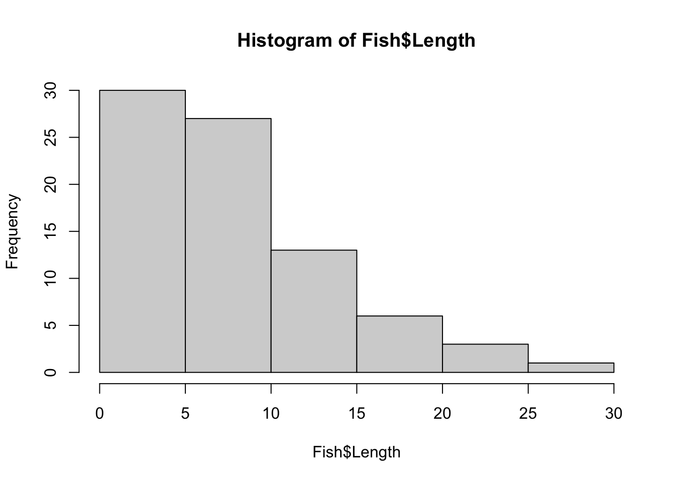
You can see straight away that all the fish were less than 30 cm long and that these length data are positively skewed - small fish are more frequent and large fish are rare.
You can alter the number of bins or the range of each bin with breaks argument. This will change the width and shape of the histogram. For example, if you wanted 15 bins, you would use:
hist(Fish$Length, breaks = 15)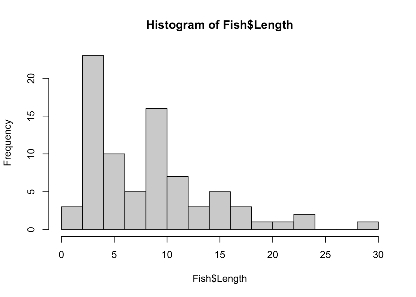
If you wanted each bin to be have a range of 2 cm, you would use breaks=seq(0,30,by=2) where the numbers in the brackets are the minimum, maximum and range for each bin.
Box and whisker plots
A box and whisker plot, or boxplot, is another useful way to visualise the distribution of a single, continuous variable. They are easily made with the boxplot function. The horizontal=TRUE argument makes the single axis horizontal.
boxplot(Fish$Length, horizontal = TRUE)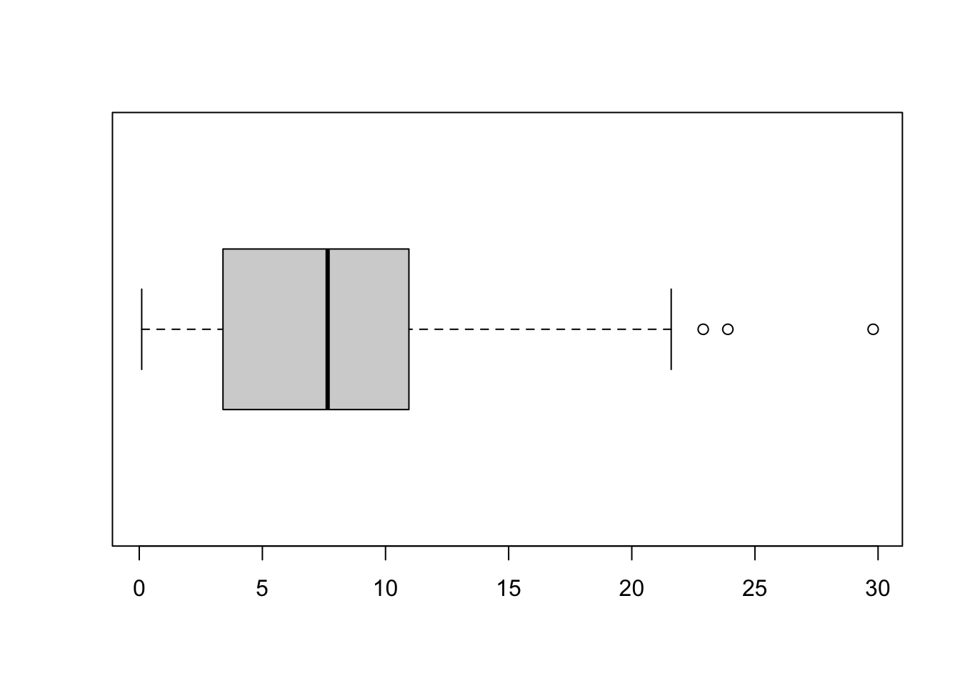
The plot shows the distribution of a variable by indicating the median, quartiles, maximum and minimum of a variable. The top and bottom whiskers are the maximum and minimum values (excluding any outliers that are indicated by a circle). The thick black line is the median, with the boxes either side of the median line the lower and upper quartiles.
Remember that the median is the value that has 50% of values larger and 50% of values smaller. Similarly, the quartiles represent the values with 25% of the values lower (the lower quartile) or 25% of values higher (the upper quartile).
The boxplot will indicate skewness in your data if the median is not equally distant from the quartiles or maximum and minimum values. In this example, you can see that the median is closer to the minimum value that the maximum (indicating that low values are more common).
Formatting plots
These simple plots can be formatted using the basic R formatting in the graphics package. The code below gives you some of the more commonly used formatting commands to give you higher control over your plots.
Add axis labels or titles
Axis labels are produced with the xlab and ylab arguments. Titles are provided with the main argument.
hist(Fish$Length, xlab = "Fish length (cm)", main = "Frequency histogram of fish length")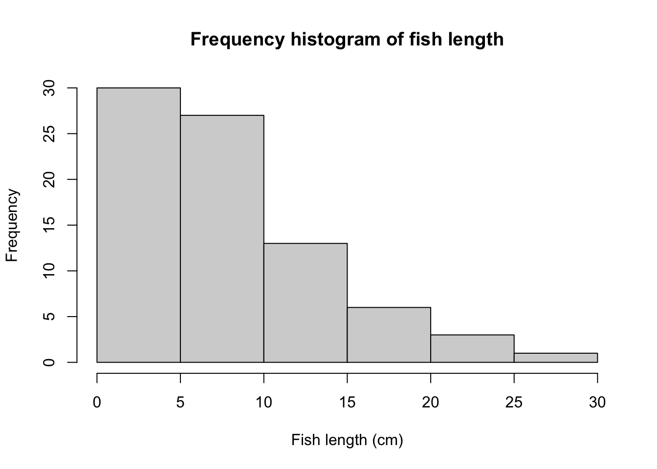
boxplot(Fish$Length, xlab = "Fish length (cm)", main = "Box plot of fish length", horizontal = TRUE)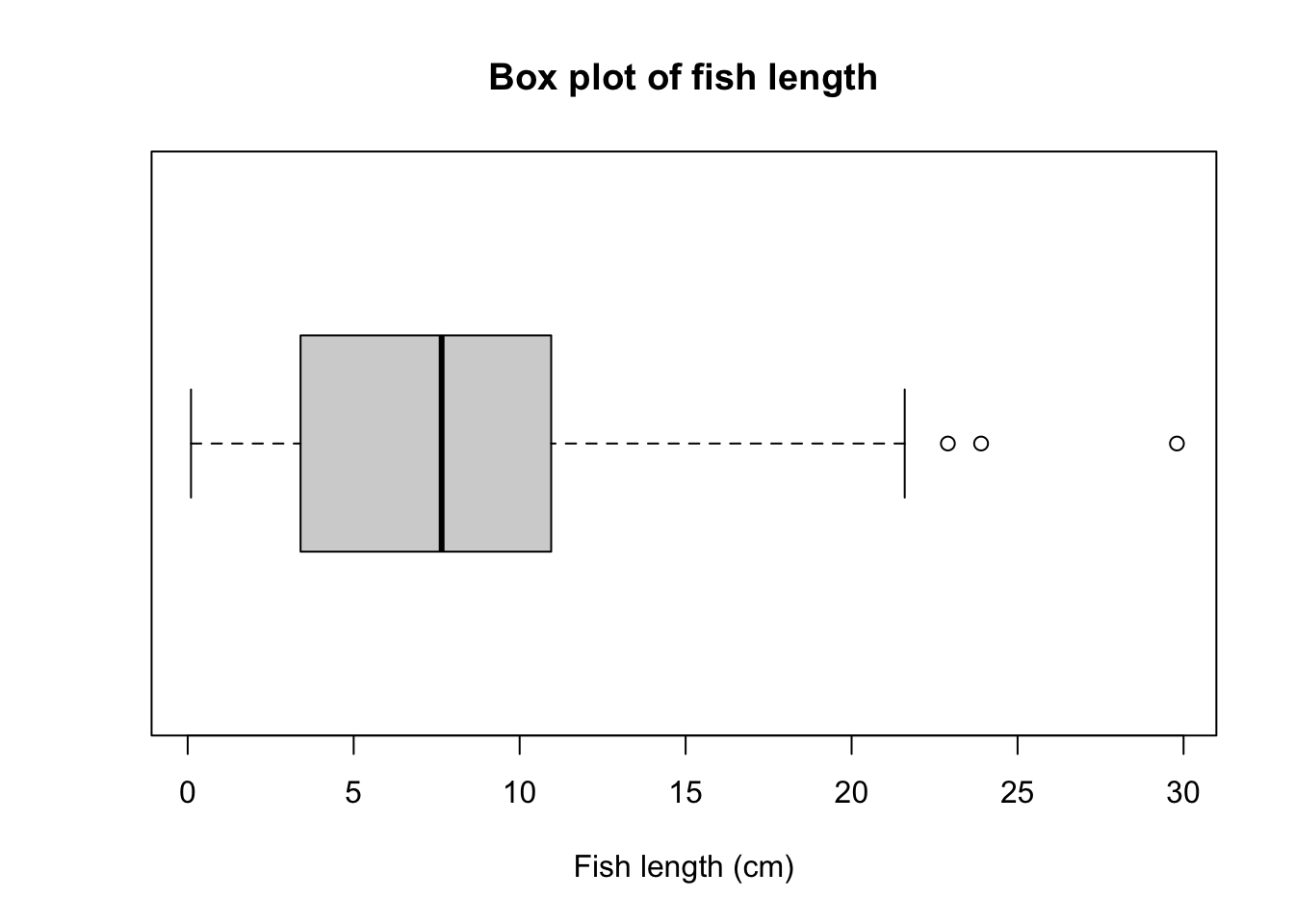
Using the main=NULL argument removes the title, which is often unecessary as details of what a plot illustrates are usually written in a figure legend below the plot.
Edit axis limits
Axis limits are set by the xlim and ylim arguments, where a vector of the minimum and maximum limits is required. For example, to have each of these plot the data between 0 and 40, you would use:
hist(Fish$Length, xlab = "Fish length (cm)", main = "Frequency histogram of fish length", xlim = c(0, 40))

boxplot(Fish$Length, xlab = "Fish length (cm)", main = "Box plot of fish length", ylim = c(0, 40), horizontal = TRUE)
Note that ylim' is needed there to set the range for the single response variable (Fish length) even though it ends up on the horizontal axis after we use thehorizontal=TRUE` argument.
Plot alignment
Use the horizontal=TRUE argument to align the box plot horizontally - leave this out if you want a vertical alignment.
Adding colour
Colour can be added to any part of the plots (axis, fonts etc.) using the col argument. There are over 600 colours that can be plotted, type colors() for the names of the whole range.
Here we will simply change the colour of the histogram.
hist(Fish$Length, xlab = "Fish length (cm)", main = "Frequency histogram of fish length", col = "red")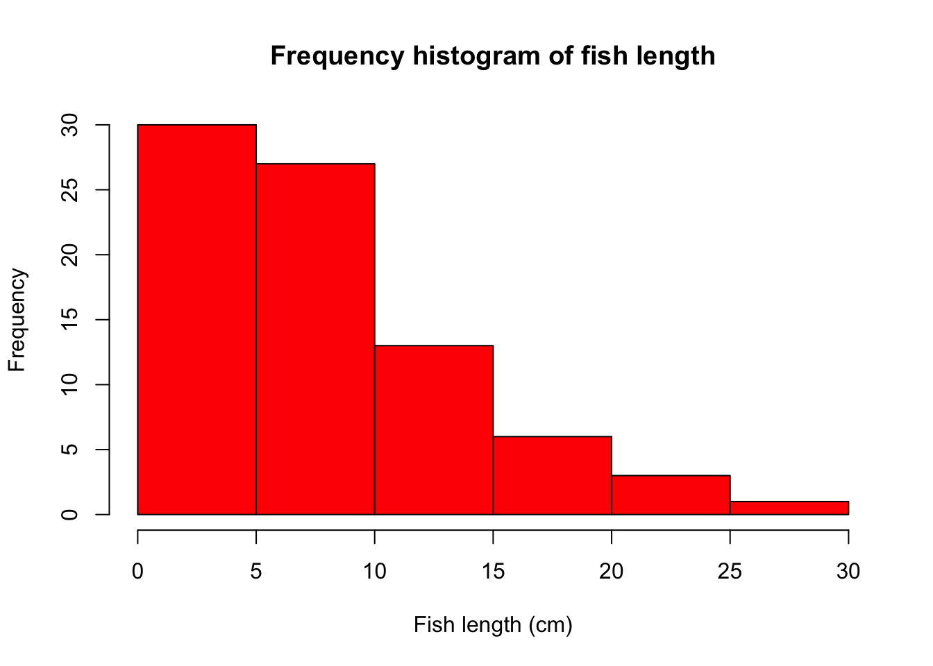
Further help
Type ?hist and ?boxplot to get the R help for these functions.
Author: Stephanie Brodie
Year: 2016
Last updated: Feb 2022