Principal Component Analysis
Principal Components Analysis (PCA) is the one of the most widely used multivariate statistical techniques. The primary motivation behind PCA is to reduce, or summarize, a large number of variables into a smaller number of derived variables that may be readily visualised in 2- or 3-dimensional space. For example, PCA might be used to compare the chemistry of different watersheds based on multiple variables or to quantify phenotypic variation amongst species based on multiple morphological measurements.
The new set of variables created by PCA can be used in other analyses, but most commonly as a new set of axes on which to plot your multivariate data.
The first principal component (PC) is fitted such that it explains the maximum amount of variation in the data. Think of this as a line of best fit in multivariate space, as close as possible to all the points with the variation maximised along the line and minimised on the perpindicular away from the line. The second PC is fitted at right angles to the first (i.e., orthogonally, with with no correlation) such that it explains as much of the remaining variation as possible. Additional PCs, which must be orthogonal to existing PCs, can then be fitted by the same iterative process.
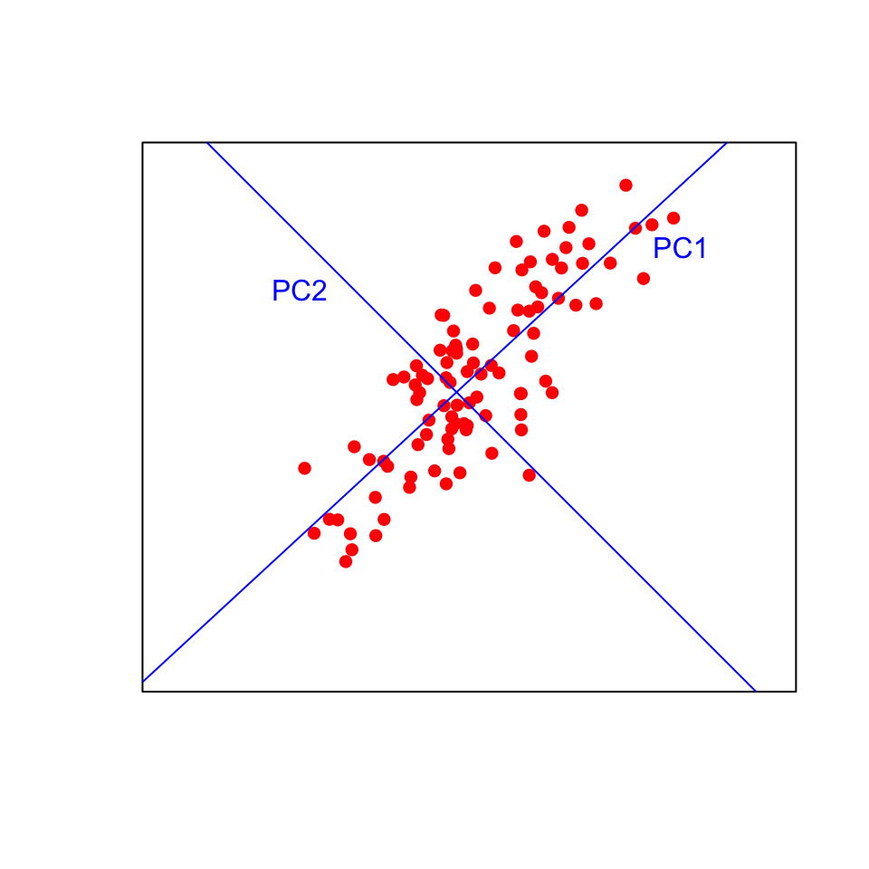
Visualising this in two dimensions helps to understand the approach. The data points will be plotted on the new blue axes (the principal components) rather than the original black axes. Now imagine fitting those lines in more than three dimensions!
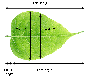
Consider a plant physiologist attempting to quantify differences in leaf shape between two species of tree. She recorded total length (leaf + petiole), leaf length, width at the widest point, width half way along the leaf and petiole length from ten leaves of each species. These data are five dimensional (i.e., five measured variables) and we can use PCA to extract two new variables that will allow us to visualise the data in fewer dimensions.
It is highly likely that there are strong relationships between variables in our example data set (e.g., leaf length vs total length). This means that the principal components are likely to explain a fair bit of the variation (imagine fitting a straight line along a sausage-shaped collection of points in multivariate space). If all variables were completely uncorrelated with each other, then PCA is not going to work very well (imagine trying to fit a line of best best fit a ball-shaped collection of points in multivariate space).
Running the analysis
Your data should be formatted with variables as columns and observations as rows. Download the sample leaf shape data set, Leafshape.csv., and import into R to see the required format.
Leaf_shape <- read.csv(file = "Leafshape.csv", header = TRUE)The first column is a categorical variable that labels the leaves by species (A or B). We need to extract that to a new object (Species) that we can use later for plotting, and make a new data frame (Leaf_data) with just the variables to be analysed by PCA (columns 2-6).
Species <- Leaf_shape$Species
Leaf_data <- Leaf_shape[, 2:6]
There are a number of function and packages in R available for conducting PCA, one of the simplest of which is the princomp function in base stats. To run a PCA, we simply use:
Leaf_PCA <- princomp(Leaf_data, cor = FALSE)Calling the plot function on the scores of the princomp output produces a score plot. This is the ordination of all 20 leaf samples in the new two-dimensional space defined by PC1 and PC2. Here, we can also label the samples by species with the colour argument, and add a legend.
plot(Leaf_PCA$scores, pch = 16, col = as.factor(Species))
legend(0, 0.4, c("Species A", "Species B"), pch = 16, col = c("black", "red"))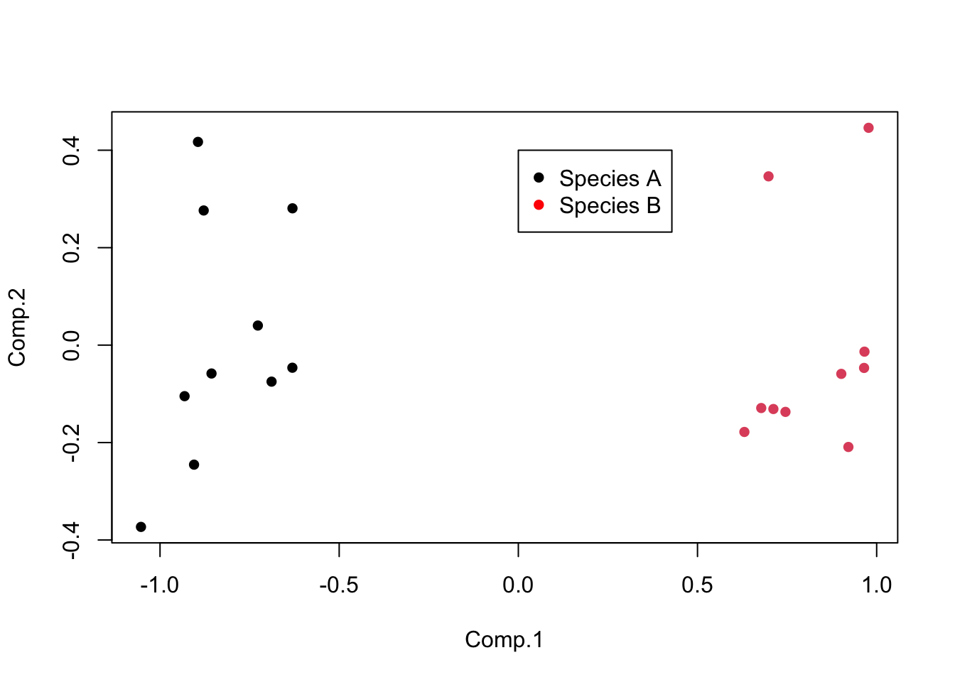
Interpreting the results
The interpretation of the score plot is the same as for any ordination plot: points that are close together have similar values of the original variables (in this case, would have been close together in five dimensional space if you can imagine that).
Principal components analysis produces a lot of graphical and numerical output. To fully interpret the results you need to understand several things:
1) How much variance is explained by each component? This can be found by using the summary object produced by the PCA.
summary(Leaf_PCA)## Importance of components:
## Comp.1 Comp.2 Comp.3 Comp.4 Comp.5
## Standard deviation 0.8302248 0.22418865 0.11987329 0.1035367 0.0089705579
## Proportion of Variance 0.9013599 0.06572552 0.01879107 0.0140183 0.0001052315
## Cumulative Proportion 0.9013599 0.96708539 0.98587647 0.9998948 1.0000000000The proportion explained independently by each component is provided in the second row of the output from summary. In this example, PC1 explains 90% of the variation between the two species with PC2 2 explaining a further 6.6%. Together, those two axes (the ones you are now plotting on) explain 96.7% of the variance (the cumulative proportion row in the output). This means that those original data in five dimensions can be placed almost perfectly on this new two-dimensional plane.
The relative contribution of each component can also also visualised by a scree plot. Note that the Y-axis presented is not the % of variation explained. The contributions always decline with the number of the component, and ideally we would want as much variation as possible explained by the first two, as these are the ones we are using to visualise the data.
screeplot(Leaf_PCA, type = "lines")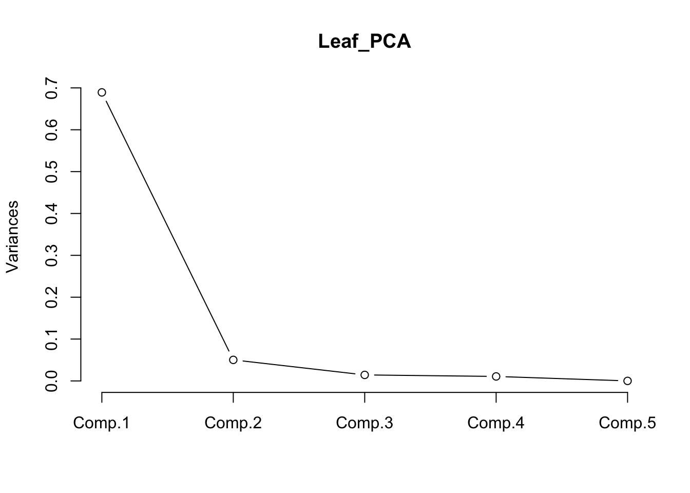
2 How are the original variables related to the principal components?
These relationships can obtained numerically by extracting the loadings from the object produced by the PCA.
loadings(Leaf_PCA)##
## Loadings:
## Comp.1 Comp.2 Comp.3 Comp.4 Comp.5
## Total_length 0.772 0.244 0.582
## Petiole_length 0.458 -0.169 0.647 -0.586
## Leaf_length 0.320 0.428 -0.627 -0.564
## Width1 -0.949 0.160 -0.215 -0.163
## Width2 -0.300 -0.259 0.826 0.400
##
## Comp.1 Comp.2 Comp.3 Comp.4 Comp.5
## SS loadings 1.0 1.0 1.0 1.0 1.0
## Proportion Var 0.2 0.2 0.2 0.2 0.2
## Cumulative Var 0.2 0.4 0.6 0.8 1.0The loadings are simple correlations between the principal components and the original variables (Pearson’s r). Values closest to 1 (positive) or -1 (negative) will represent the strongest relationships, with zero being uncorrelated.
In this example, you can see that PC1 is positively correlated with the two width variables. R doesn’t bother printing very low correlations, so you can also see that PC1 is uncorrelated with the three length variables. Given the the two species are split along the x-axis in the score plot (PC1), we now know that species A with high values of PC1 has wider leaves than species B with low values of PC1. We also know that leaves toward the top of the plot are the longest due to the positive correlations between PC2 and the three length variables (but this does not separate the two species on the plot).
You can also produce a biplot with the relationships between the original variables and the principal components overlaid on the score plot. The original variables (in red) will have a strong relationship with one of the principal components if they are parallel to that component (eg Width 1 and PC1) and longer arrows represent stronger correlations.
biplot(Leaf_PCA)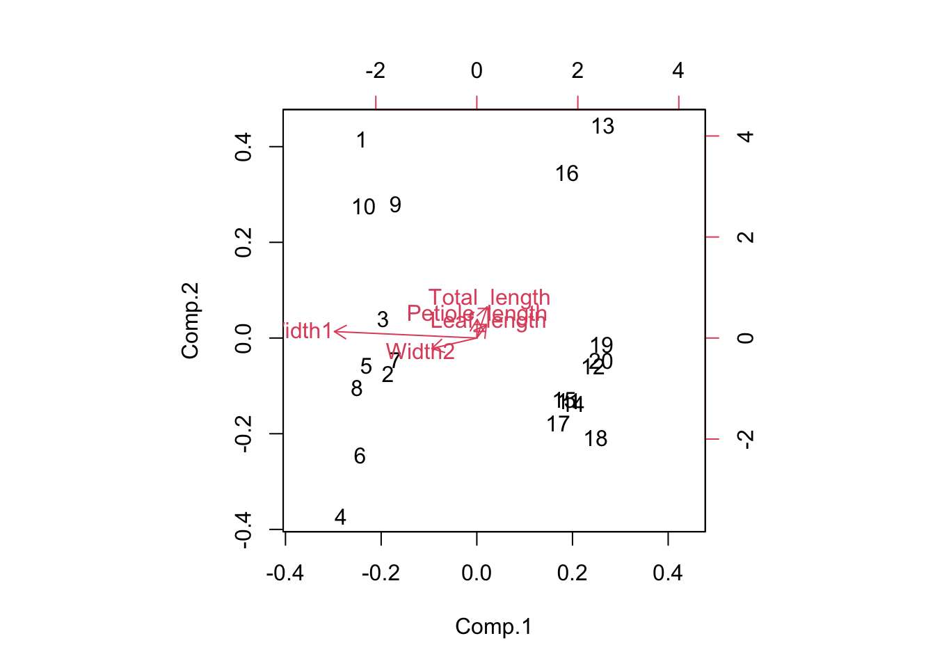
Assumptions to check
Linearity. PCA works best when the relationship between variables are approximately linear. In the absence of linearity it is best to transform variables (e.g., log transform) prior to the analysis.
Correlation vs covariance matrices. You can run PCA using a covariance matrix, which is appropriate when all variables are measured on the same scale, or a correlation matrix, which is appropriate if variables are measured on very different scales. These will produce different output because using a covariance matrix is affected by differences in the size of variances among the variables. Researchers also commonly standardise variables prior to the analysis if they would like variables that were measured on different scales to have an equal influence on the output.
Change between these two options with the cor argument in the princomp function.
Leaf_PCA <- princomp(Leaf_data, cor = FALSE) # uses a covariance matrix
Leaf_PCA2 <- princomp(Leaf_data, cor = TRUE) # uses a correlation matrix
Outliers. Outliers can have big influence on the results of PCA, especially when using a covariance matrix.
Rotating axes. The princomp function produces an unrotated principal components analysis. There are options in other R packages for rotating the principal components after they have been derived with the aim of an output that is easier to interpret (e.g., where the loadings within a component are close to one or zero). There are several methods for doing this, and you would need to read more than this help module before attempting such methods.
Communicating the results
Written. In the results section, it would be typical to state the amount of variation explained by the first two (or three) PCs and the contribution of different variables to those PCs. In this example, you would state that the first principal component explained 90% of the variation in leaf morphology and was most strongly related to leaf width at the widest point.
Visual. PCA results are best presented visually as a 2-dimensional or, rarely, a 3-dimensional ordination plot (see above) where the position of each observation represents is position in relation to the first two (or three) principal components. It is common to label the points in some way to seek patterns on the plot (like how we labelled leaves by species above).
Further help
Type ?princomp to get the R help for this function.
An nice interactive page to help you understand what PCA is doing can be found here.
Quinn, GP and MJ Keough (2002) Experimental design and data analysis for biologists. Cambridge University Press. Ch. 17. Principal Components and Correspondence Analysis.
McKillup, S (2012) Statistics explained. An introductory guide for life scientists. Cambridge University Press. Ch. 22. Introductory concepts of multivariate analysis.
Author: Andrew Letten
Year: 2016
Last updated: Feb 2022