Customising your ggplot
ggplots are almost entirely customisable. This gives you the freedom to create a plot design that perfectly matches your report, essay or paper.
The overall appearance can be edited by changing the style or prescence of grid lines, axis notches, panel colour, legend colour or outlines.
Before you get started, read the page on the basics of plotting with ggplot and install the package ggplot2.
library(ggplot2)Creating a customised theme
One of the most effective ways to customise your plot is to create a customised theme and separate this from your basic ggplot code. By separating and saving your theme, it will be much easier to edit, alter and reuse for other projects.
In these examples, let’s use a data set that is already in R with the length and width of floral parts for three species of iris. First, load the data set:
data(iris)The following code for a scatter plot of petal length vs sepal length with the three species colour-coded is the base that we will use throughout this tutorial.
IrisPlot <- ggplot(iris, aes(Sepal.Length, Petal.Length, colour = Species)) +
  geom_point()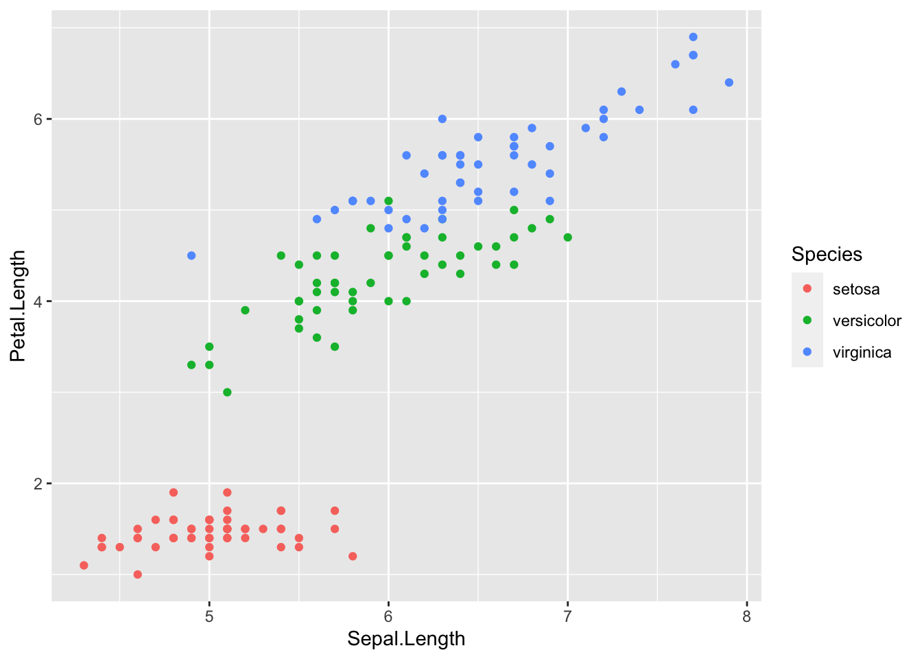
To change the design of an element of your plot, you create a theme then print the plot with the theme applied. For example, some code to change the colour and size of the legend in the above plot would look like this.
mytheme <-
  theme(legend.title = element_text(colour = "steelblue", size = rel(2)))
We would then reprint the base plot with this theme added:
print(IrisPlot + mytheme)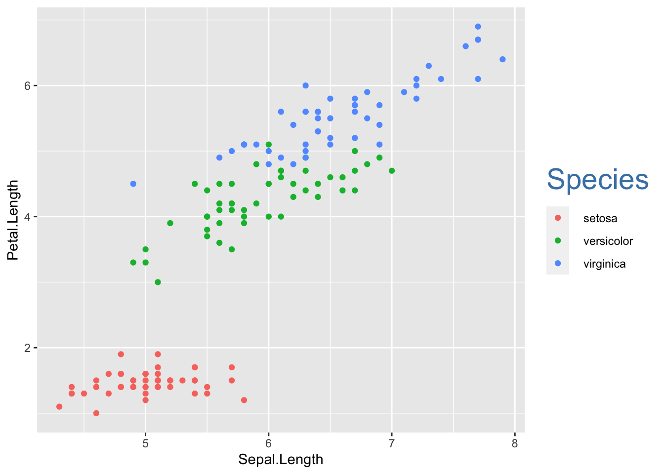
Themes can have many different elements, that relate to legends, axes, titles etc. Separate each within the theme code with a comma.
Formatting the plot and legend background
The plot and legend background can be changed to any colour listed here using the following code:
panel.background = element_rect(your format)will alter the panel behind the graph.
legend.key = element_rect(your format)alters the boxes next to each category name.
legend.background = element_rect(your format)will alter the box around the legend names and boxes.
For each of these, the formats you can alter are:
fill = "colour"to colour the panel behind the plot.
colour = "colour"will alter the axis outline of the graph.
size = (number)will alter the thickness of this outline.
To demonstrate how this works, here is a ugly theme with obvious colours chosen to demonstrate the differences:
mytheme <-
  theme(
    panel.background = element_rect(
      fill = "black",
      colour = "yellow",
      size = 4
    ),
    legend.key = element_rect(fill = "darkgrey", colour = "yellow"),
    legend.background = (element_rect(colour = "yellow", fill = "blue"))
  )

print(IrisPlot + mytheme)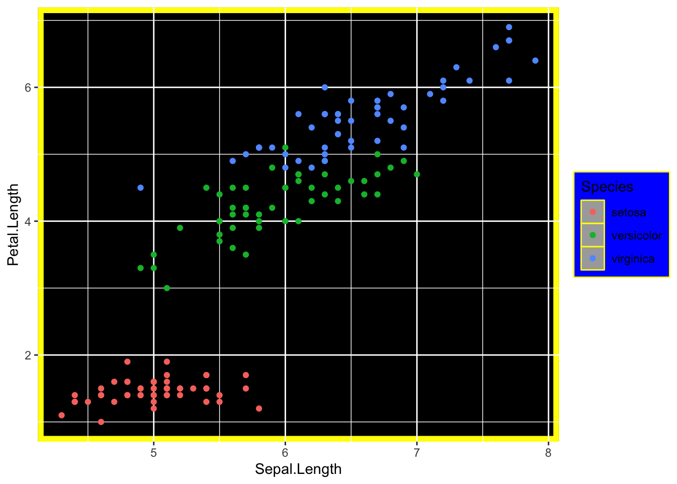
Altering the size, colour or presence of grid lines
The grid lines are divided into two sets of grid lines; major and minor. This allows you to accentuate or remove half the grid lines.
* panel.grid.major = element_line(your format) - alters the format of major grid lines.
* panel.grid.minor = element_line(your format) - alters the format of minor grid lines.
where (your format) specifies the colour and thickness of the lines.
Formats include:
* Colour. For example, colour = "steelblue2" - remember to include “” before and after the colour name.
* Size. Specified by entering a number, for example, size = (3).
Putting these together in a theme would look like this:
mytheme <-
  theme(
    panel.grid.major = element_line(colour = "black", size = (1.5)),
    panel.grid.minor = element_line(
      size = (0.2), colour =
        "grey"
    )
  )

print(IrisPlot + mytheme)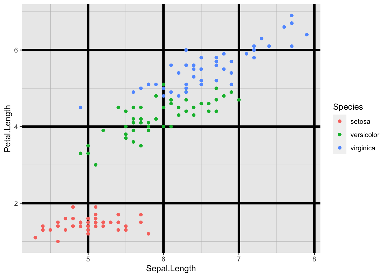
To remove the grid lines, use the element_blank().
mytheme <- theme(panel.grid.minor = element_blank(), panel.grid.major = element_blank())

print(IrisPlot + mytheme)
Altering the x and y axis lines
The size and colour of axis lines themselves can be customised in the same way as the grid lines (above), using axis.line=element_line(your format). For example:
mytheme <-
  theme(
    axis.line = element_line(size = 1.5, colour = "red"),
    panel.background = element_rect(fill = "white")
  )

print(IrisPlot + mytheme)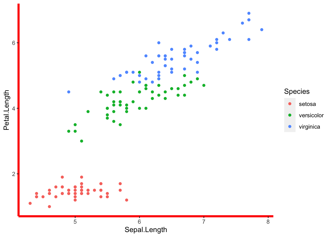
Altering the axis ticks/notches
The size and colour of the ticks can be altered using axis.ticks = element_line(your format). For example:
mytheme <- theme(axis.ticks = element_line(colour = "red", size = (2)))

print(IrisPlot + mytheme)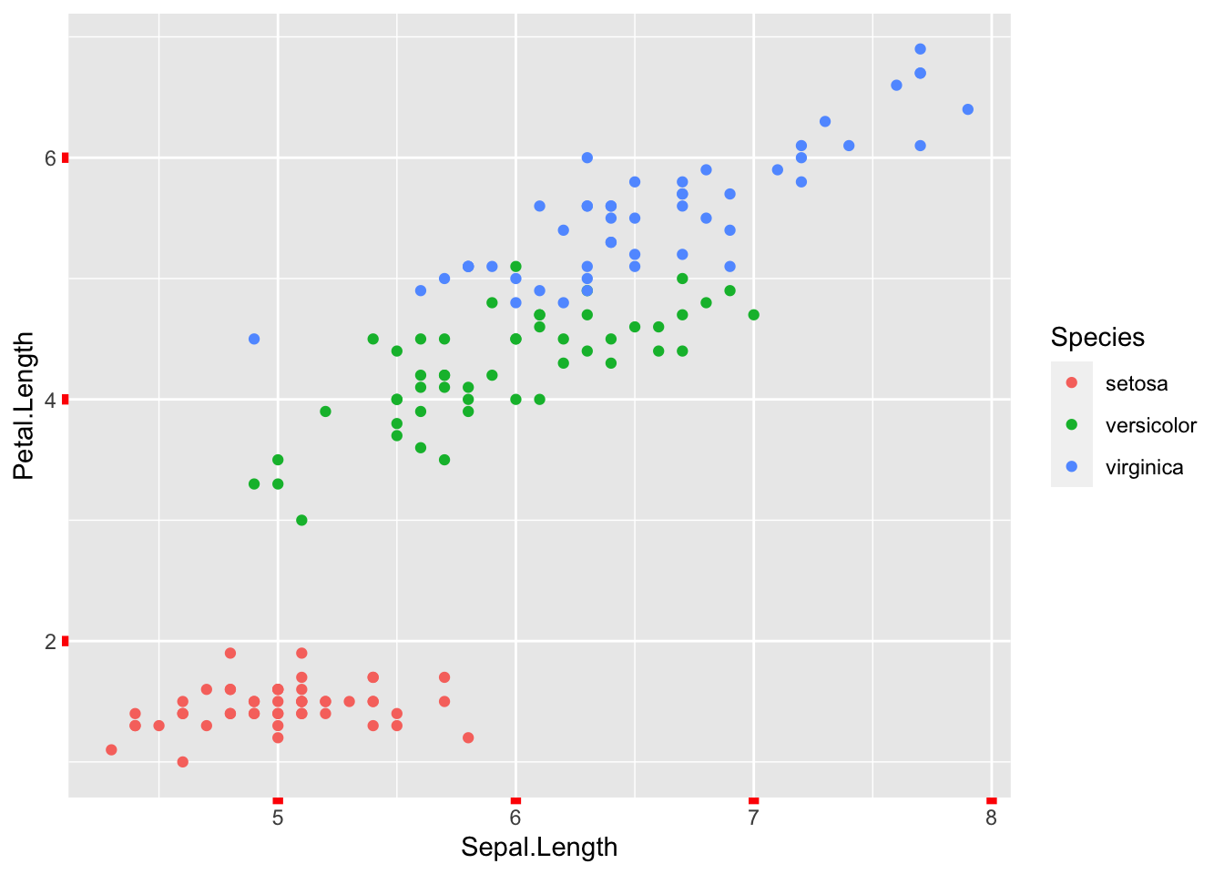
Removing any element of a theme
= element_blank() is used if you wish to entirely remove an element of the formatting. For example, to get rid of ticks, grid lines and the background, you would use:
mytheme <-
  theme(
    axis.ticks = element_blank(),
    panel.grid.minor = element_blank(),
    panel.grid.major = element_blank(),
    panel.background = element_blank()
  )

print(IrisPlot + mytheme)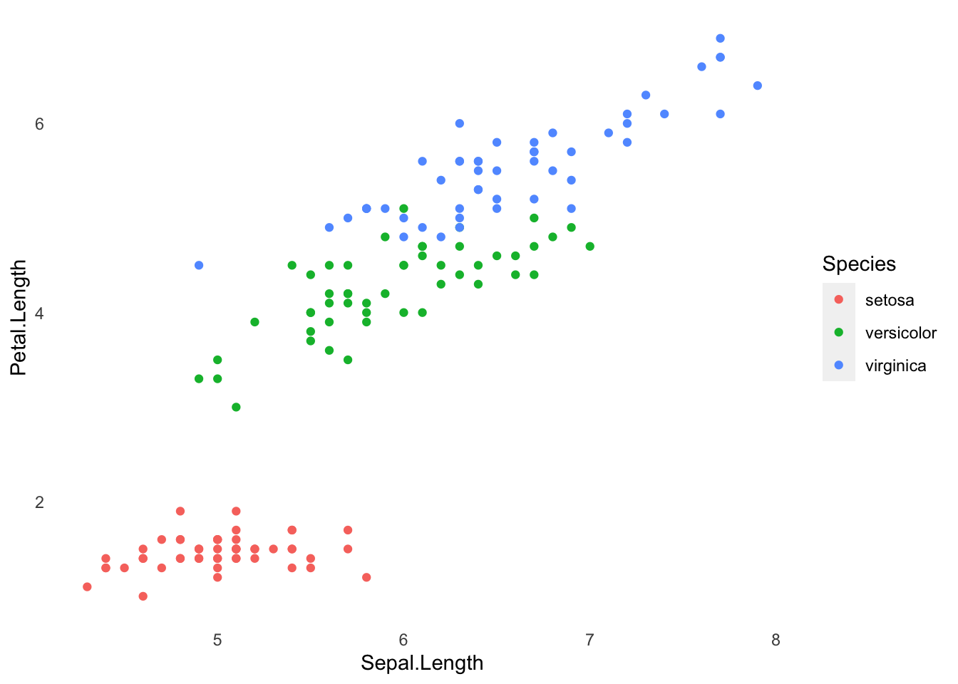
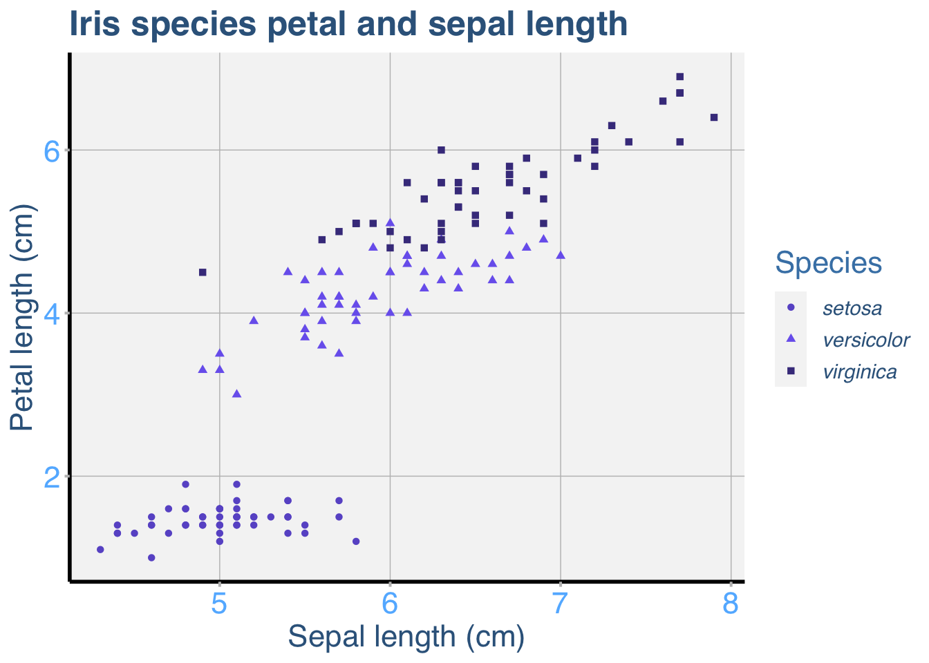
Example of a fully customised ggplot
Here is an example of a ggplot with many of the elements customised. This is obviously a lot of code, but remember that you can save and reuse your favorite theme as often as you like. See the page on adding titles and axis names for help with those parts of the print() code.
IrisPlot <-
  ggplot(
    iris,
    aes(
      Sepal.Length,
      Petal.Length,
      colour = Species,
      shape = Species
    )
  ) +
  geom_point()

mytheme3 <-
  theme(
    legend.text = element_text(
      face = "italic",
      colour = "steelblue4",
      family = "Helvetica",
      size = rel(1)
    ),
    axis.title = element_text(
      colour = "steelblue4",
      family = "Helvetica",
      size = rel(1.5)
    ),
    axis.text = element_text(
      family = "Helvetica",
      colour = "steelblue1",
      size = rel(1.5)
    ),
    axis.line = element_line(size = 1, colour = "black"),
    axis.ticks = element_line(colour = "grey", size = rel(1.4)),
    panel.grid.major = element_line(colour = "grey", size = rel(0.5)),
    panel.grid.minor = element_blank(),
    panel.background = element_rect(fill = "whitesmoke"),
    legend.key = element_rect(fill = "whitesmoke"),
    legend.title = element_text(
      colour = "steelblue",
      size = rel(1.5),
      family = "Helvetica"
    ),
    plot.title = element_text(
      colour = "steelblue4",
      face = "bold",
      size = rel(1.7),
      family = "Helvetica"
    )
  )

print(
  IrisPlot + mytheme3 + ggtitle("Iris species petal and sepal length")
    + labs(y = "Petal length (cm)", x = "Sepal length (cm)", colour = "Species")
    + scale_colour_manual(values = c("slateblue", "slateblue2", "slateblue4"))
)
###Further help
To further customise the aesthetics of the graph, including colour and formatting, see our other ggplot help pages:
* adding titles and axis names
* colours and symbols.
Help on all the ggplot functions can be found at the The master ggplot help site.
A useful cheat sheet on commonly used functions can be downloaded here.
Chang, W (2012) R Graphics cookbook. O’Reilly Media. - a guide to ggplot with quite a bit of help online here
Author: Fiona Robinson
Year: 2016
Last updated: Feb 2022